Loopa
Brand identity, mascots, illustration and website for a litigation-funding company.

Mascots and branding for a litigation-funding company
Loopa is a litigation-funding company. It pays for legal cases so that people with a fair claim can afford to pursue them. We designed the brand identity, a cast of mascots, an illustration and icon set and the website.
Law and finance brands mostly look alike: dark blue, serif type and stock photos. Loopa wanted people to understand what it does and to remember it, and chose to do that with mascots.
01Concept
The mascot concept
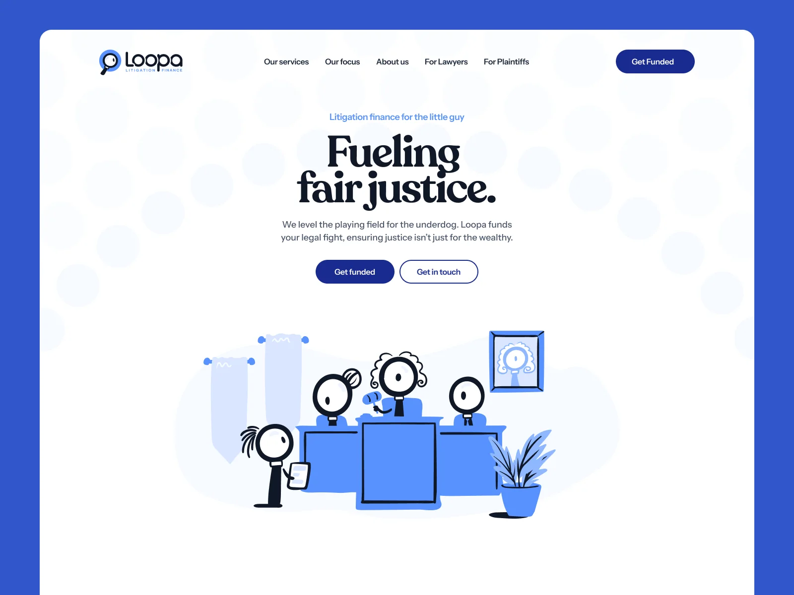
The mascots are figures with a magnifying glass for a head. It fits the name, and it fits what the company does, which is to look closely at a case before funding it.
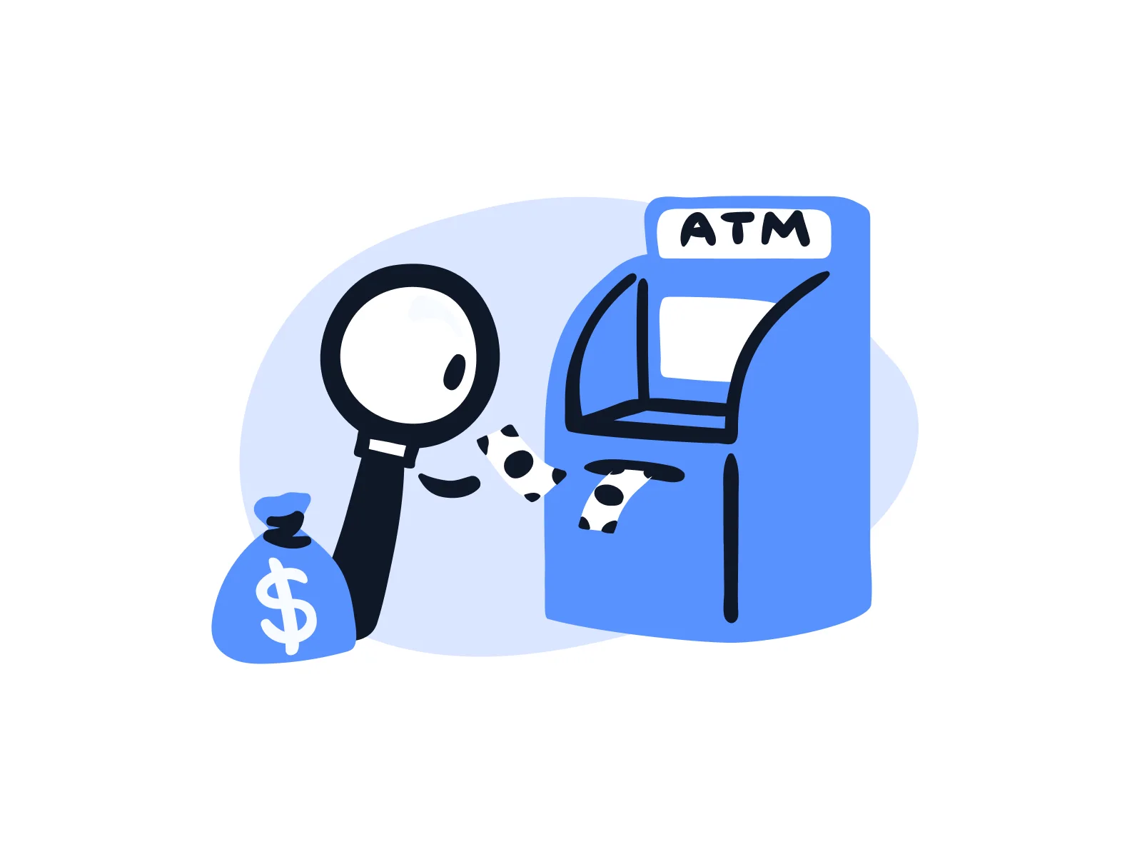
They also make the product easier to explain. Legal finance is abstract, but a mascot taking money out of an ATM shows a payout at a glance.
Illustration system and icon set
All illustrations use three colours: cobalt blue, black and white. We drew scenes for the main topics, such as planting an investment, collecting returns and a tug of war with the other side.
The icon set follows the same style, so icons and illustrations can sit next to each other.




03Branding
Brand identity
The headlines are set in a serif typeface, the logo combines a magnifying glass with the wordmark, and the pages have a lot of white space. The result looks serious enough for lawyers and friendly enough for people bringing a claim.
Website design
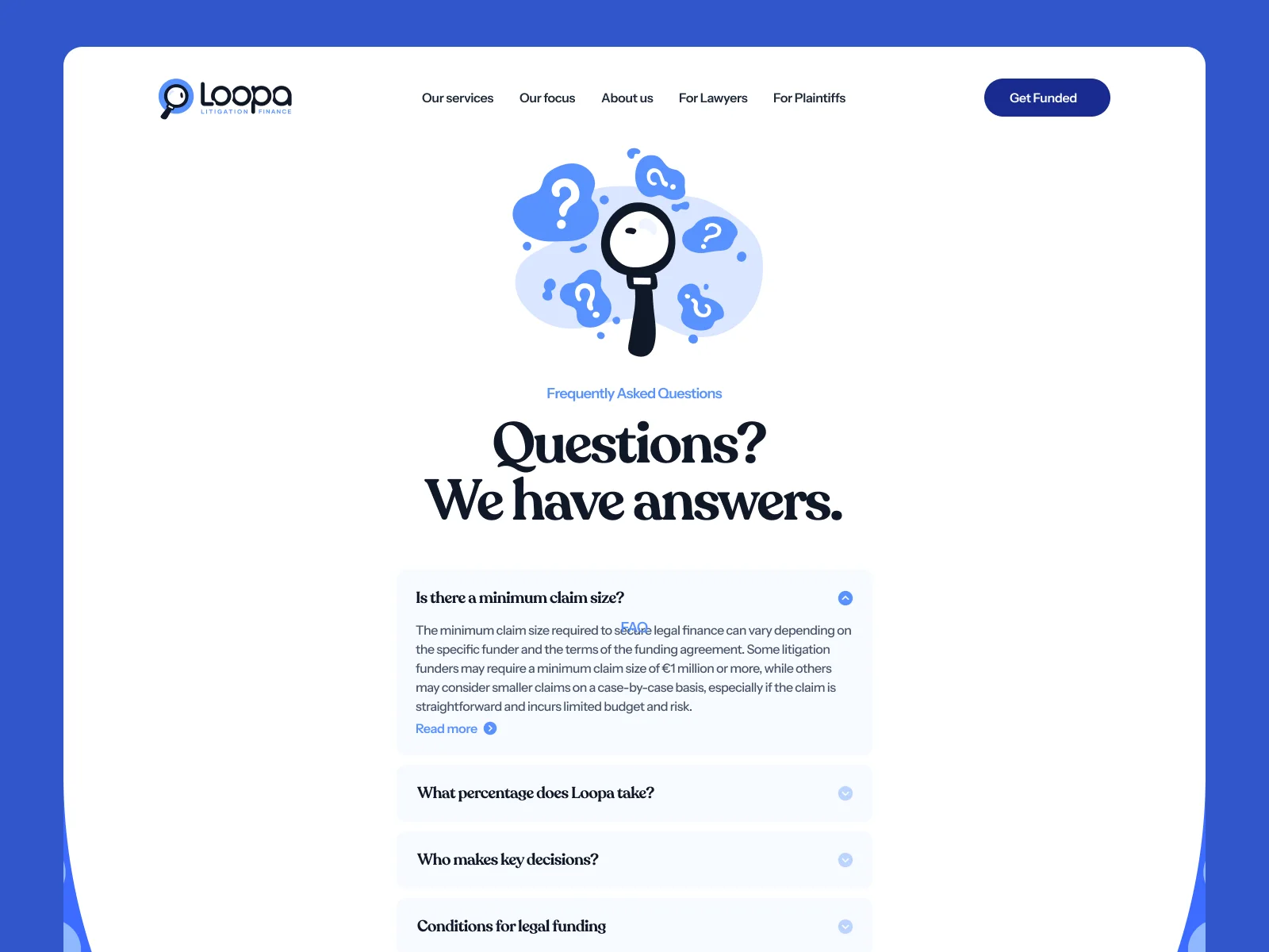
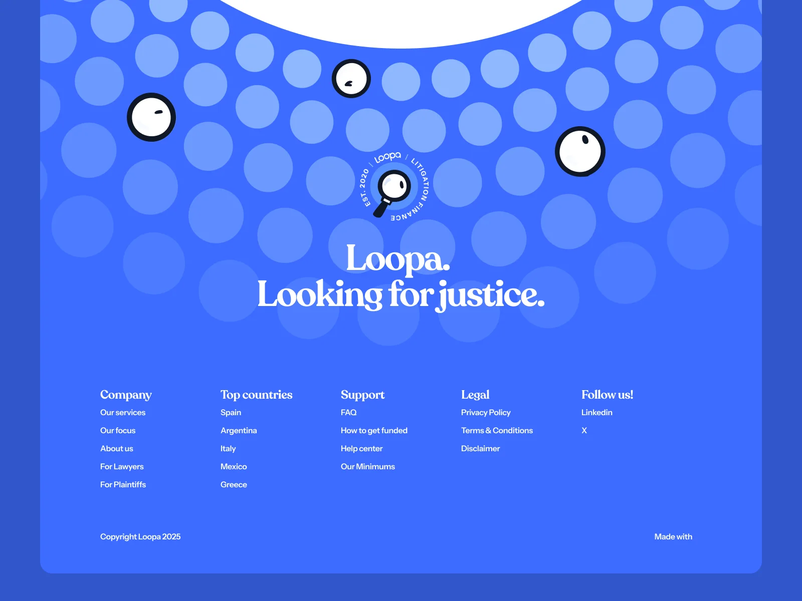
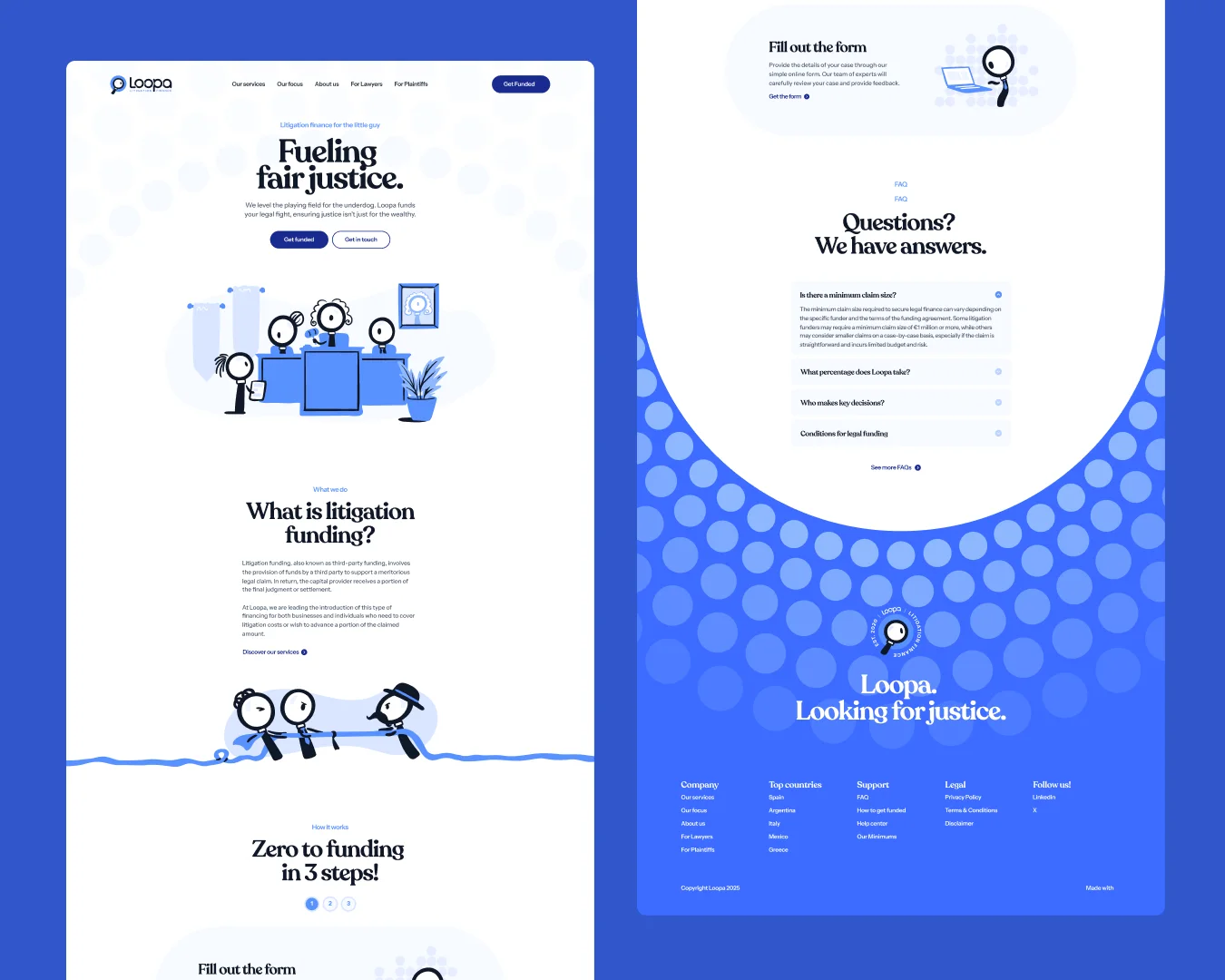
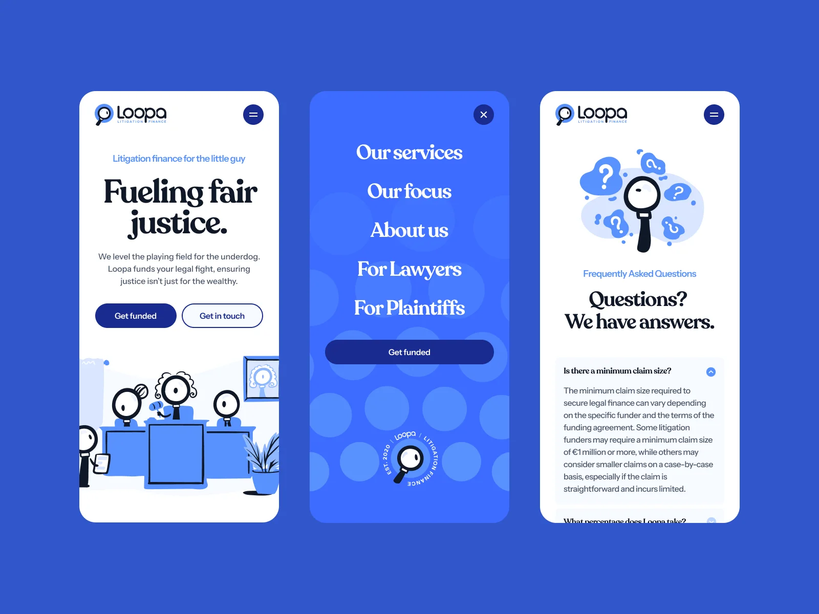
The website uses the mascots in every section: the hero, the explanation of how funding works, the FAQ and the footer. We designed it for desktop and mobile.
Team on this project
- Creative direction, brand and web designDario Ferrando
- Mascot design and illustrationMary Delaney