Balloon

Mascot redesign, rebrand and App Store screens for a gut-health tracking app.

Mascot redesign for a gut-health app
Balloon is an iOS app for tracking gut health. Users log their stool and what they eat, and the app shows triggers and patterns. In 2026 we redesigned the Balloon mascot and the brand around it, and designed new App Store screens.
The topic is a bit embarrassing and can feel clinical. The team wanted the app to feel friendly and light, without looking like a product for children.
01Concept
A mascot with a full range of expressions
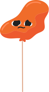
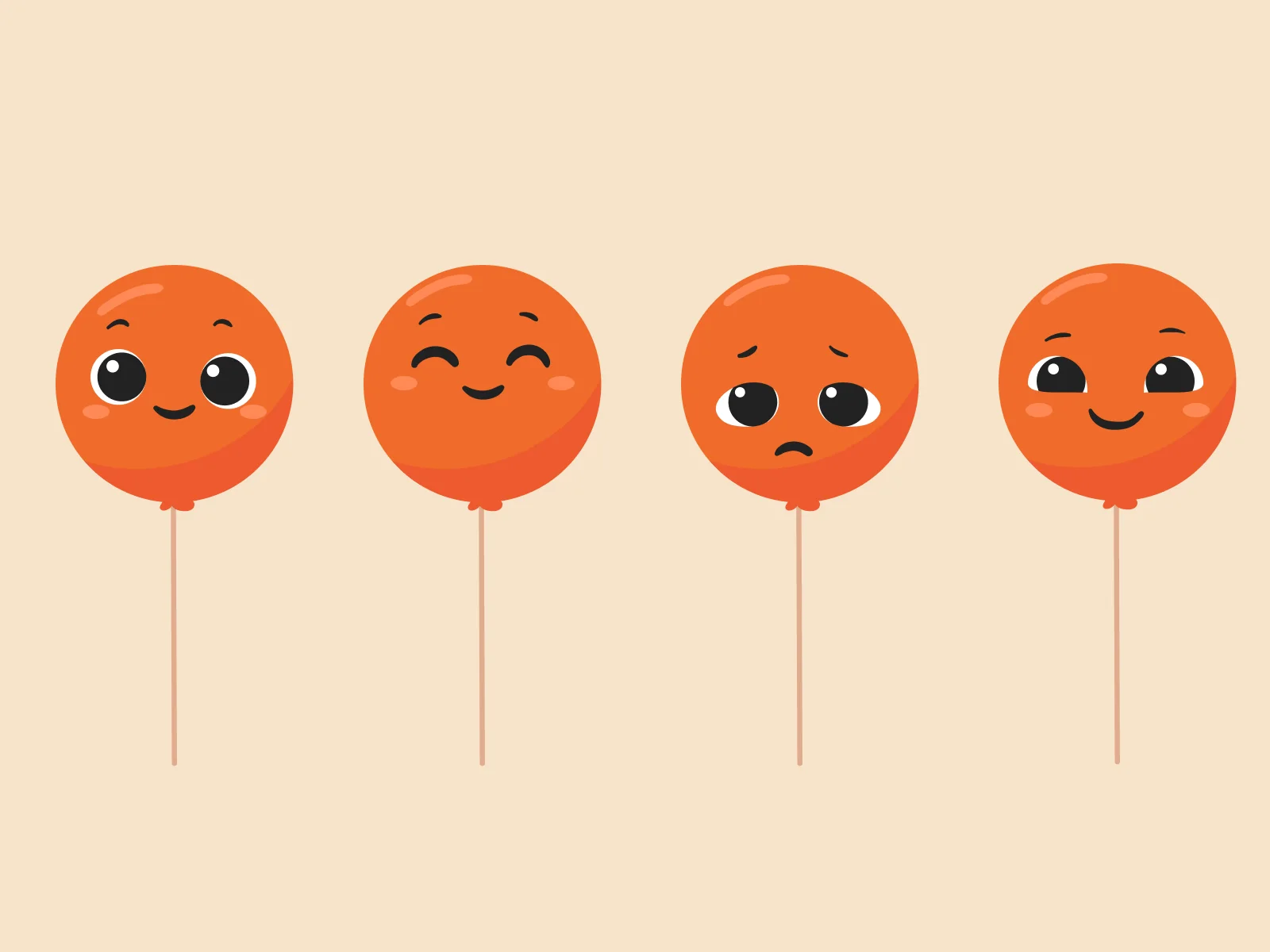
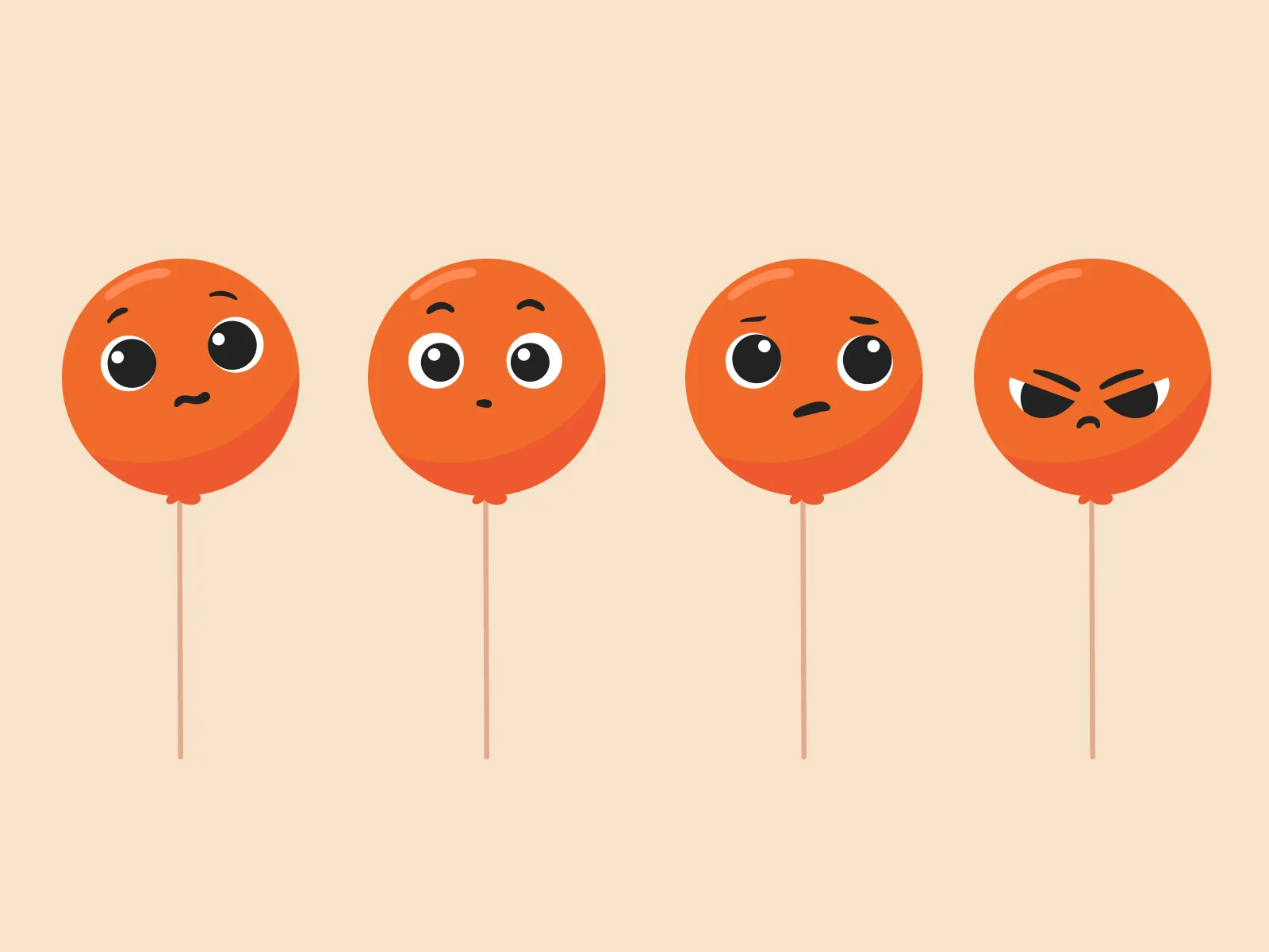
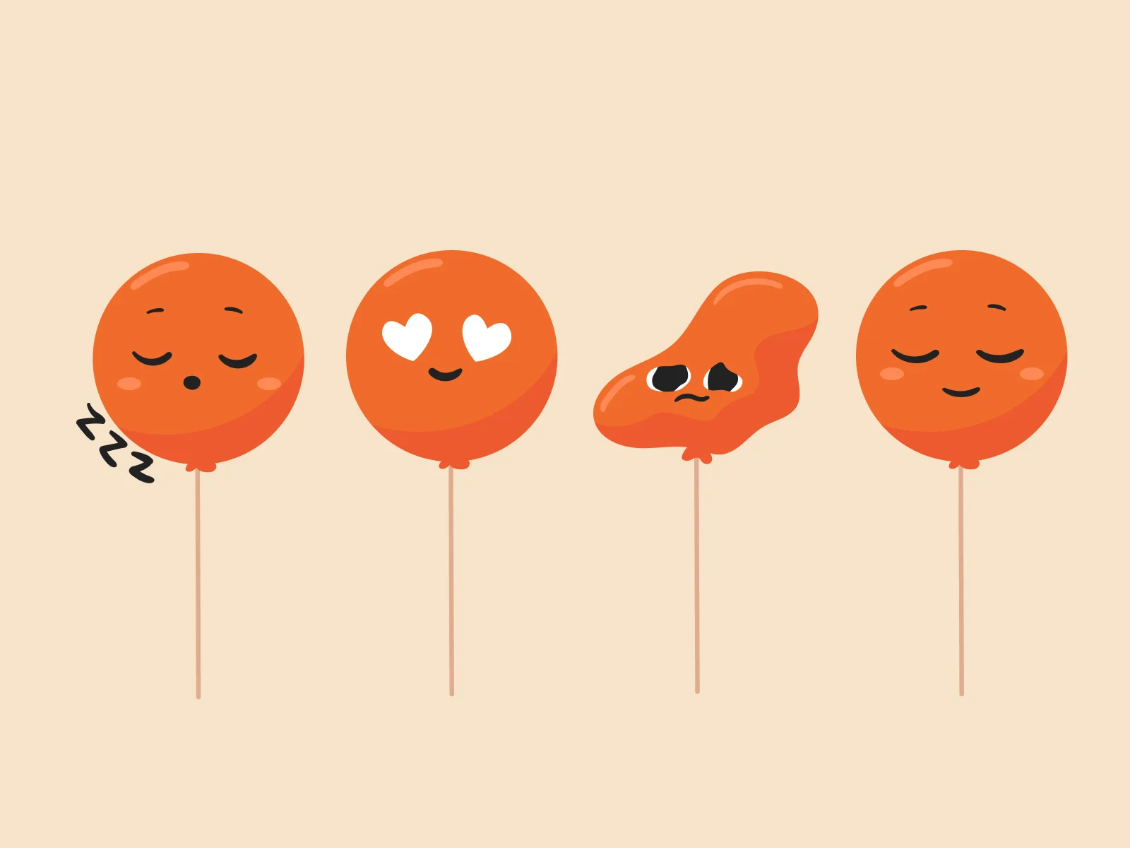
We simplified the shape of the balloon and drew a full expression sheet: happy, smug, worried, queasy, angry, asleep, in love and deflated.
With these expressions the app can react to what you log. A good day and a bad day now look different.




Food mascots and an illustrated stool chart
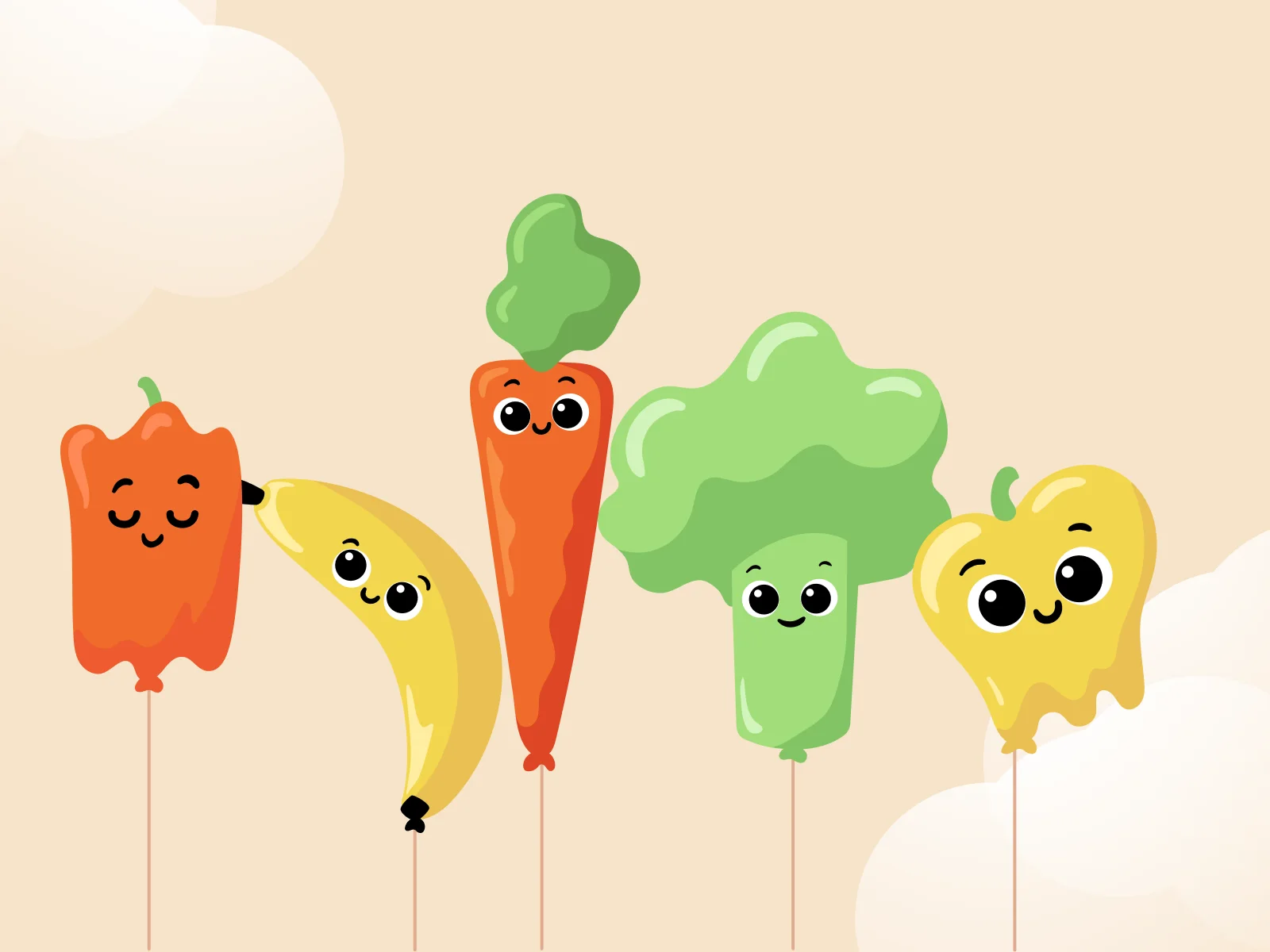
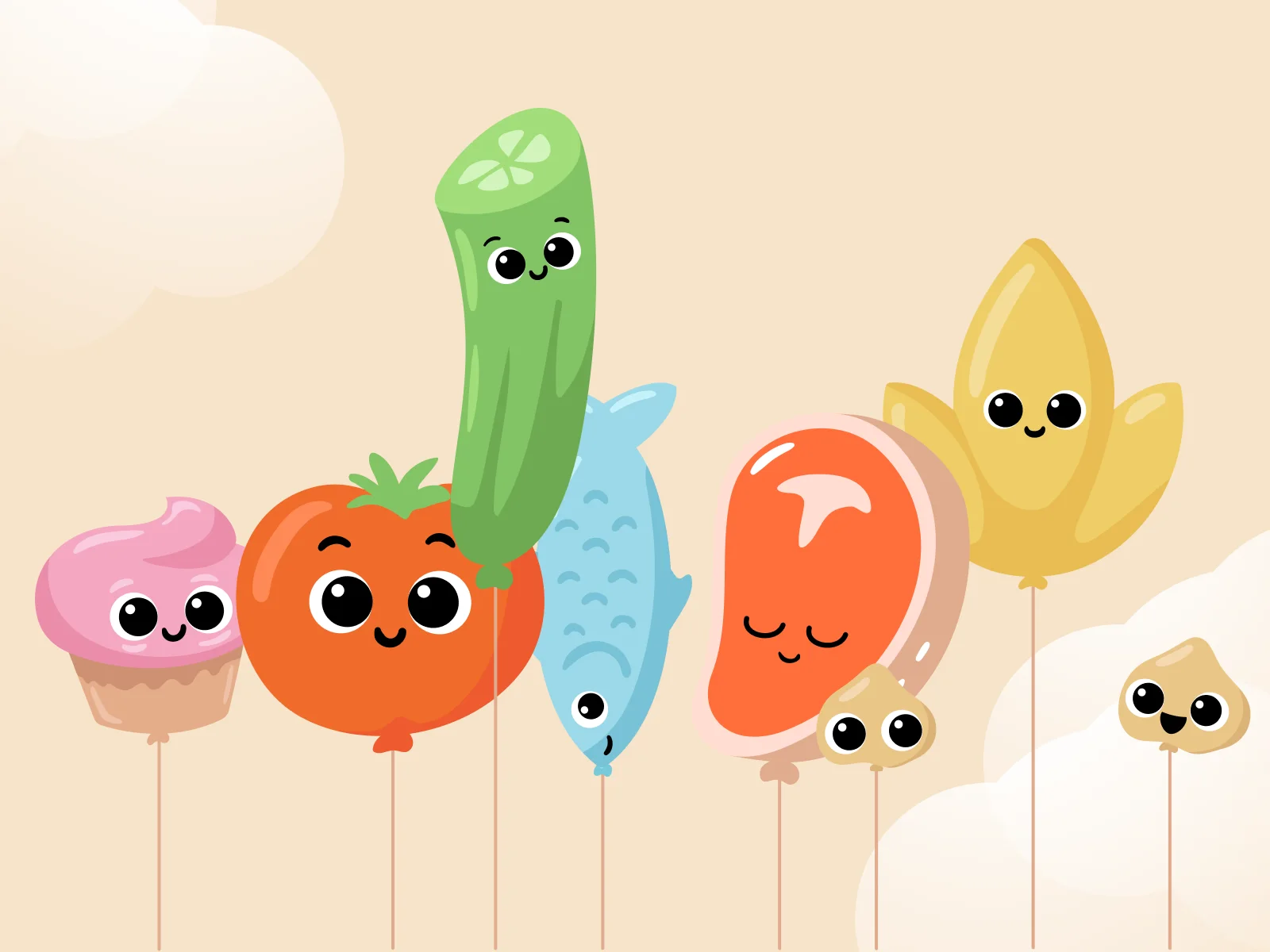
We extended the balloon into a family. Hearts, stars, question marks and diamonds stand for features of the app. A set of food balloons covers what users eat, including peppers, bananas, broccoli, cupcakes and fish.
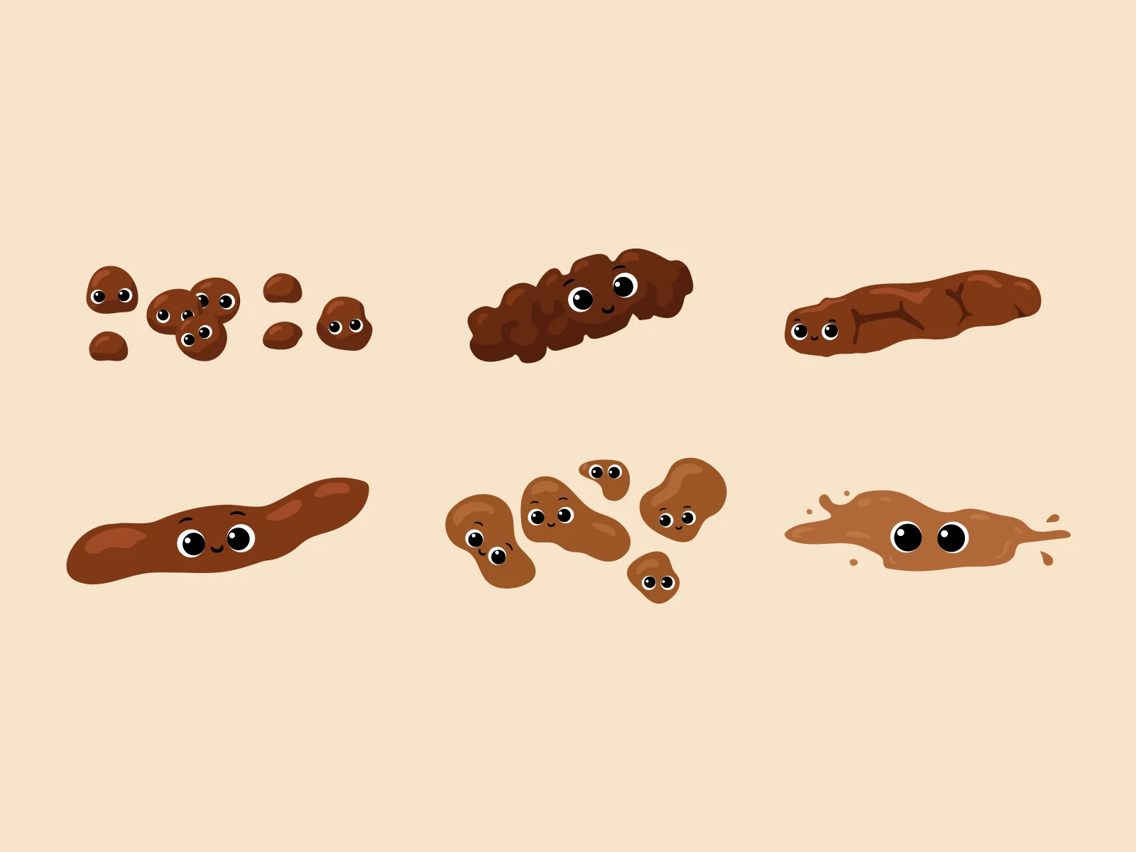
We also illustrated the stool chart. Each type is drawn as a small friendly mascot, which makes logging feel less like filling in a medical form.
03Branding
Logo and brand identity
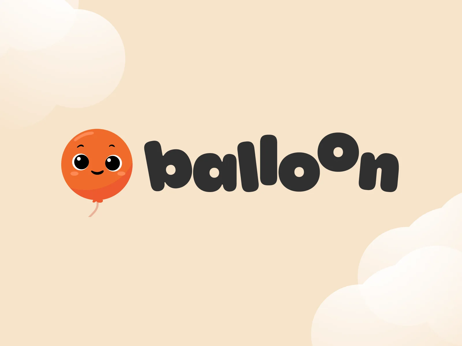
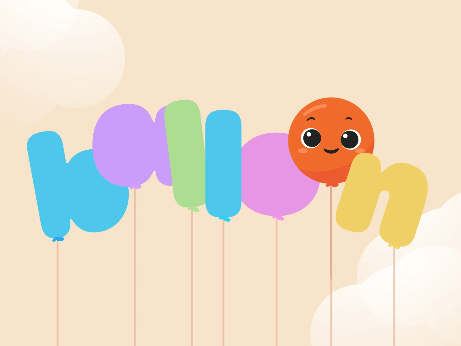
The new logo places the balloon next to a soft, rounded wordmark. In a second version the letters themselves are balloons. The colours are cream and orange.
App Store screenshot design
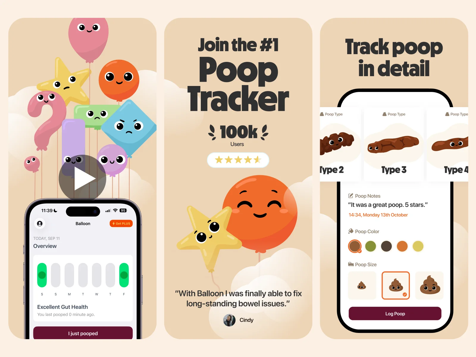
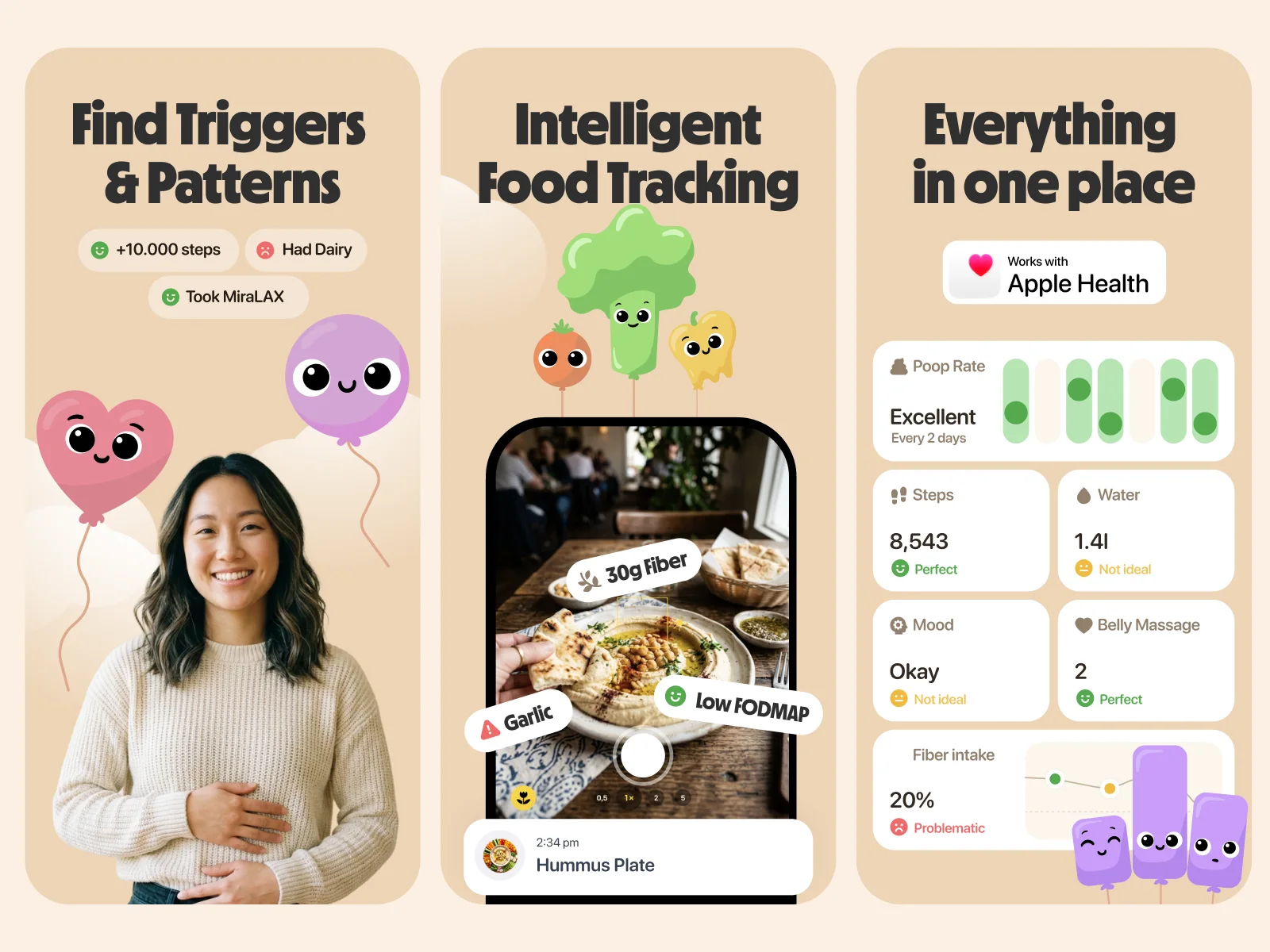
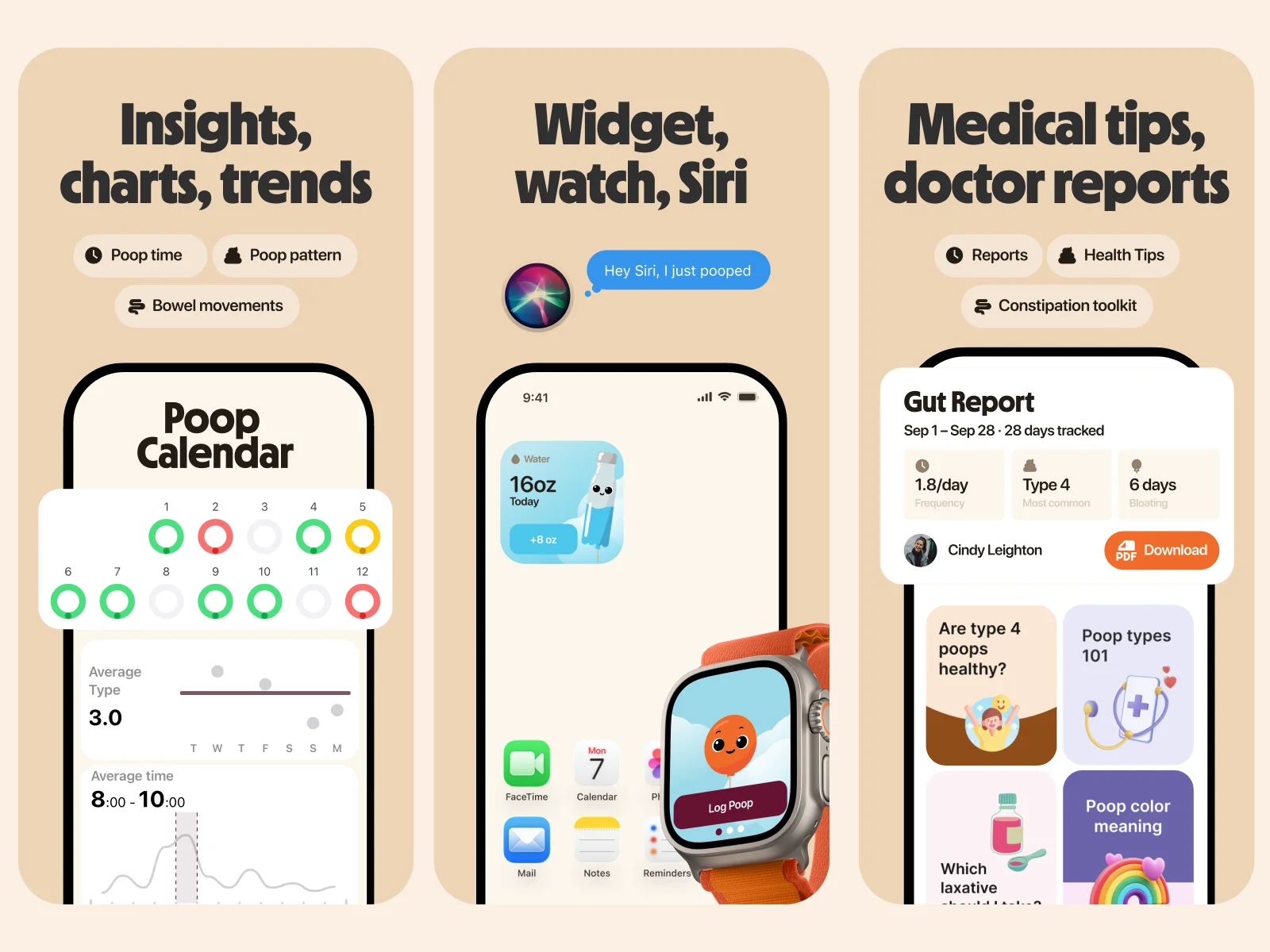
We redesigned the App Store screenshots. Each screen explains one feature: tracking, triggers and patterns, food logging, insights, widgets and doctor reports. A balloon mascot appears on each one.
Team on this project
- Creative direction and brand designDario Ferrando
- Mascot design and illustrationMary Delaney
- MotionArsen Airyan