Detach
A full rebrand for a screen-time app, built around a raccoon mascot.
Rebranding a screen-time app around a raccoon mascot
Detach is an iOS app that helps people block the apps they overuse. In spring 2025 we rebranded it from the ground up: a raccoon mascot, a sticker set and illustrated world, animations, the brand identity, the website and the full iOS app. The project won a German Design Award in 2026.
The Detach team came to us in March 2025, a few months before launch. Their existing brand was not what they wanted to launch with, and they asked for something more playful and easier to remember.
The app uses psychology and gamification, with daily challenges that help people cut down their screen time step by step. The brand had to make that feel like a game people want to play.
01Concept
Finding the mascot concept
Our first concept had no mascot. It showed two worlds: a colourful one for life without the phone and a grey one for doomscrolling. We designed a homepage, challenge cards, app screens and illustrations in that direction and reviewed them with the team.
Everyone agreed it was too negative. People open this app every day, and nobody wants to be told their life is grey. We kept the colours and the tone and looked for a different story.
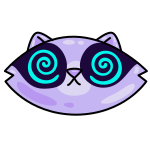
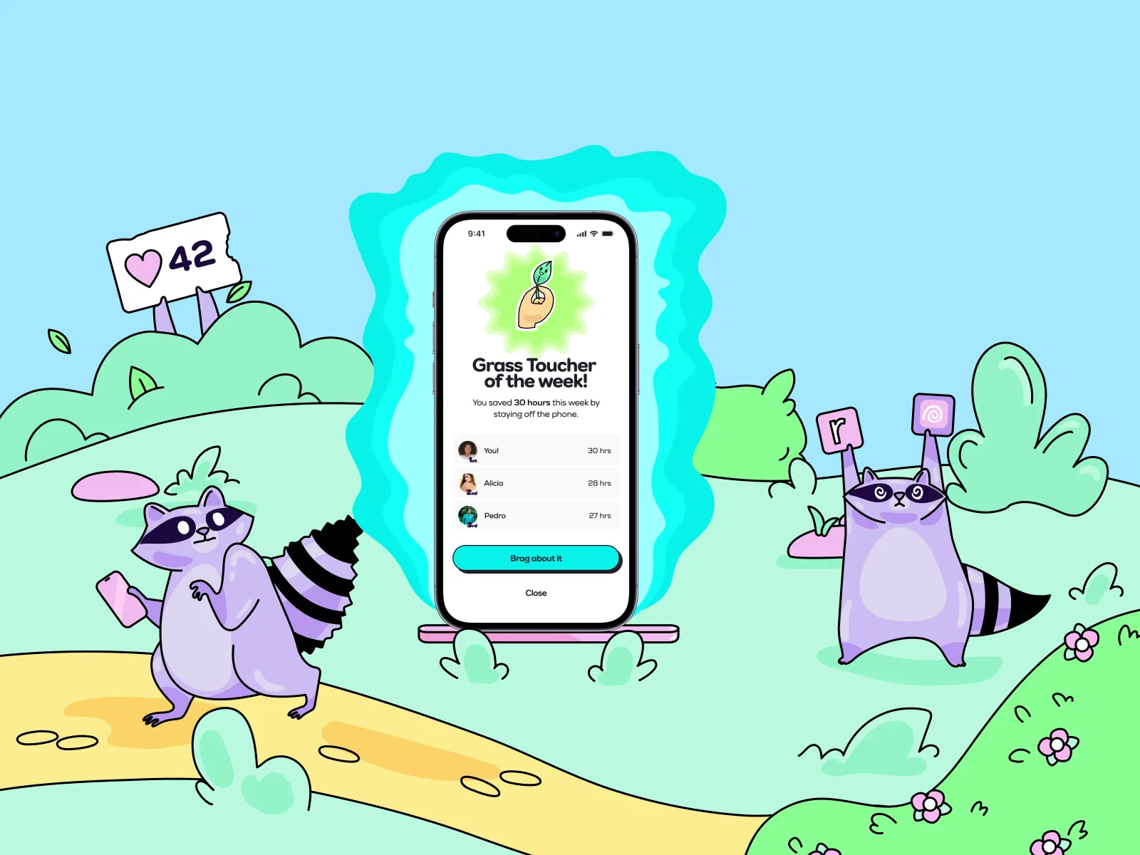
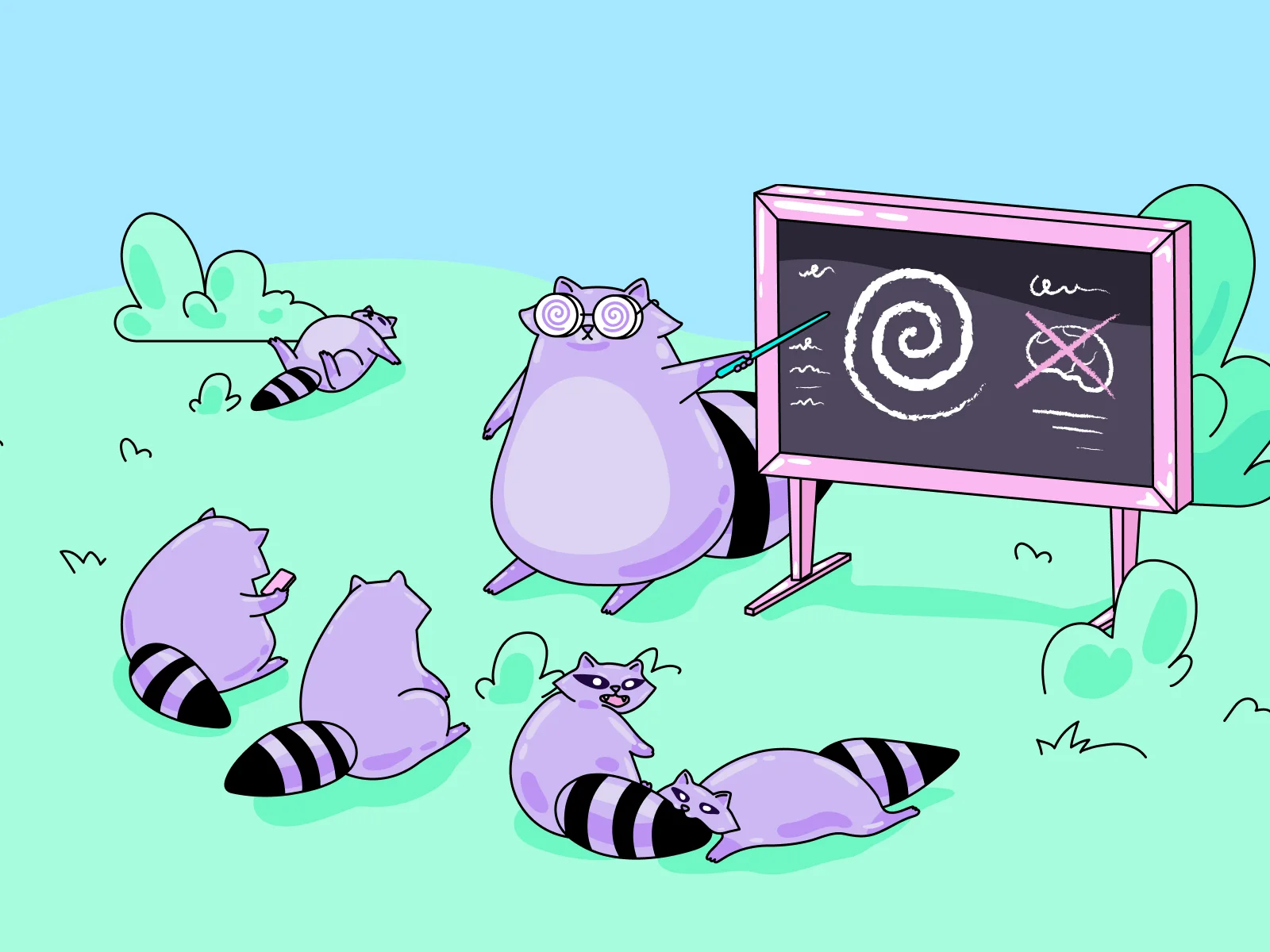
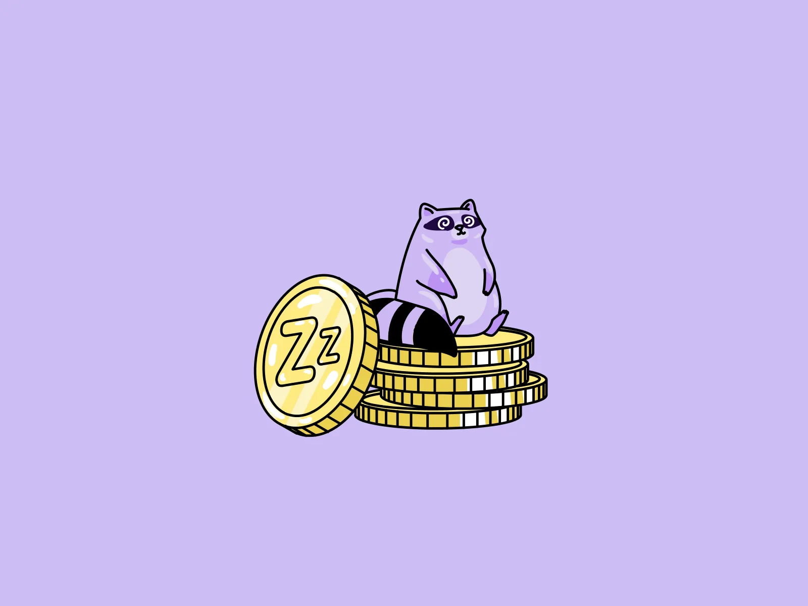
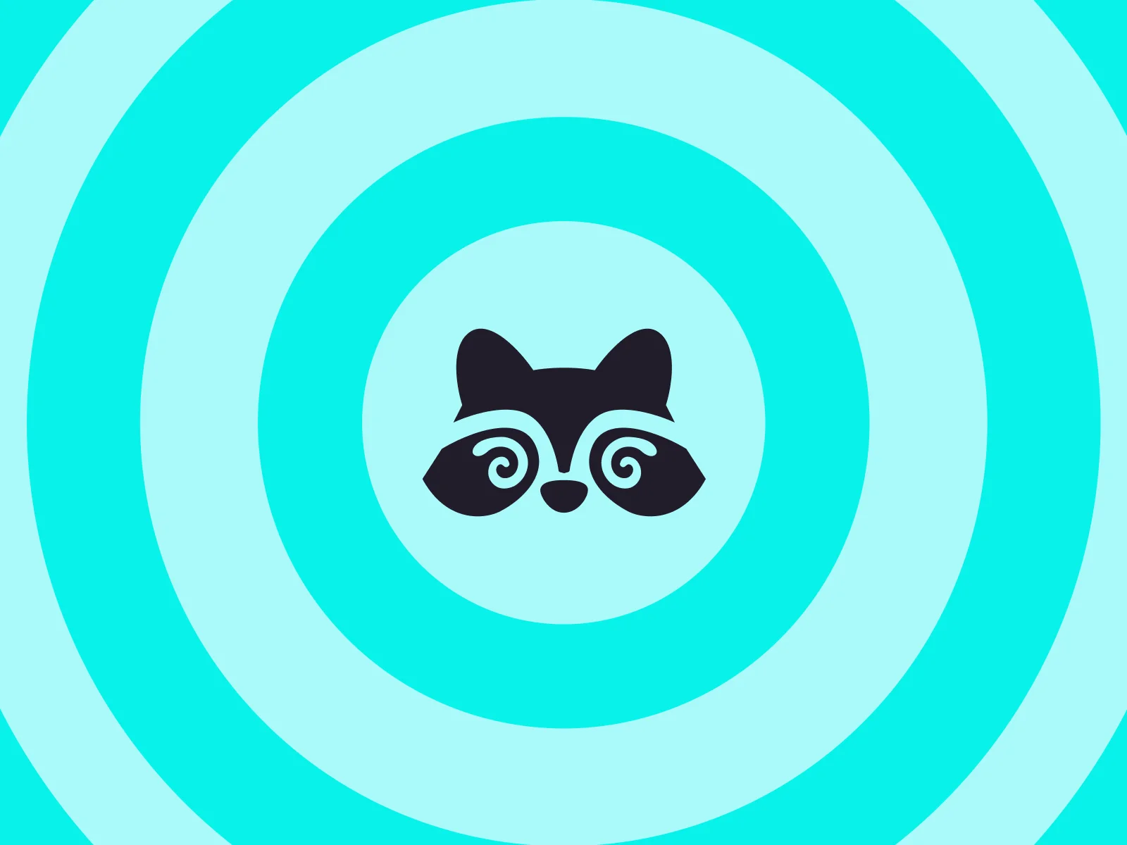
We ended up with a raccoon. Raccoons are chaotic, have little self-control and will grab anything shiny, which is a fair description of most of us with a phone. In the Detach world every user is a raccoon. The spiral in its eyes stands for confusion and addiction, and it became the main symbol of the brand.
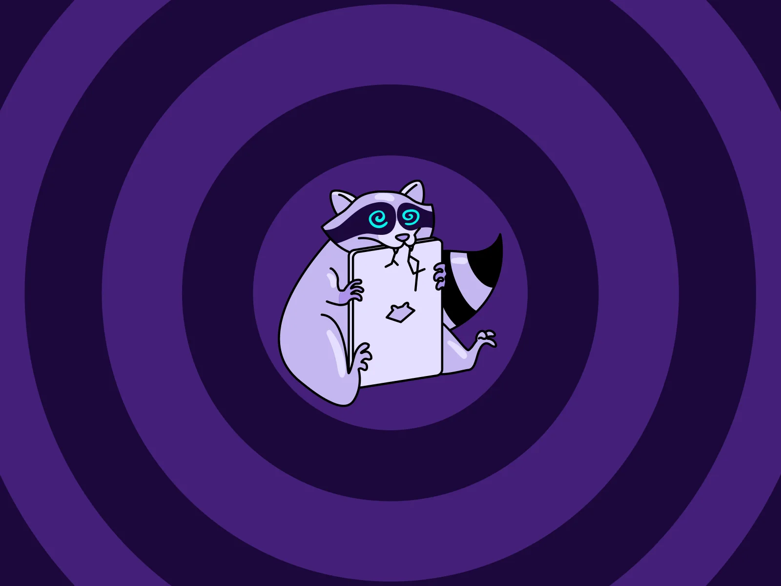
Sticker set and illustrated world
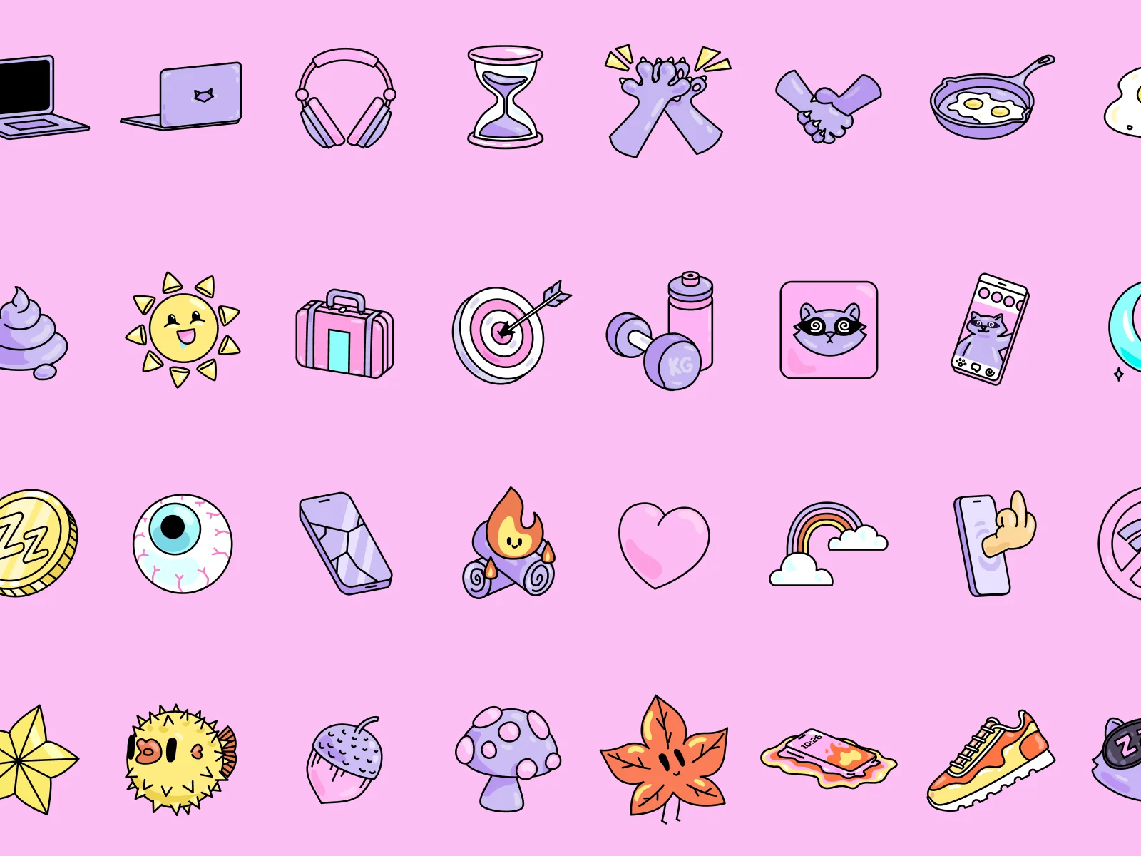
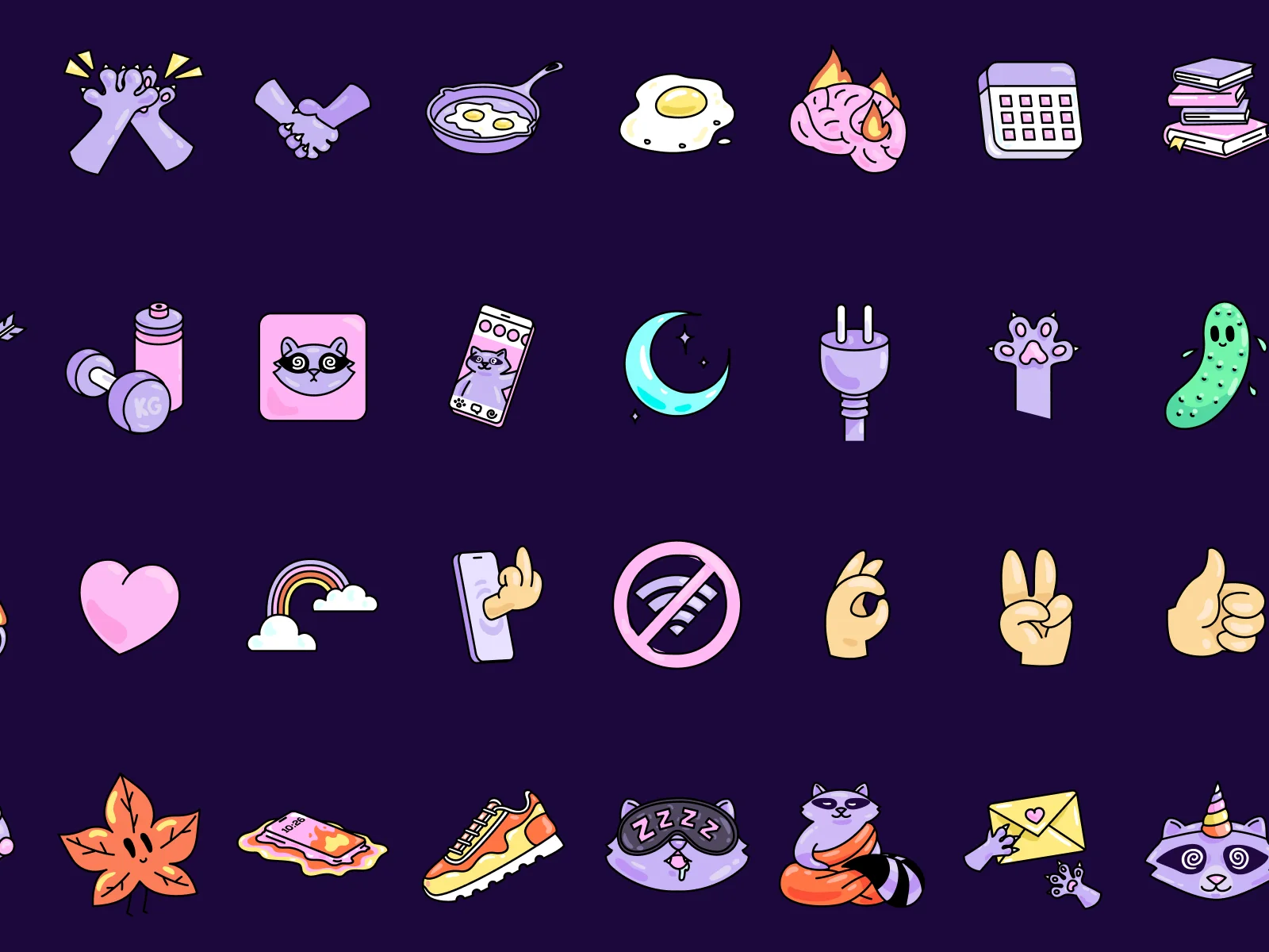
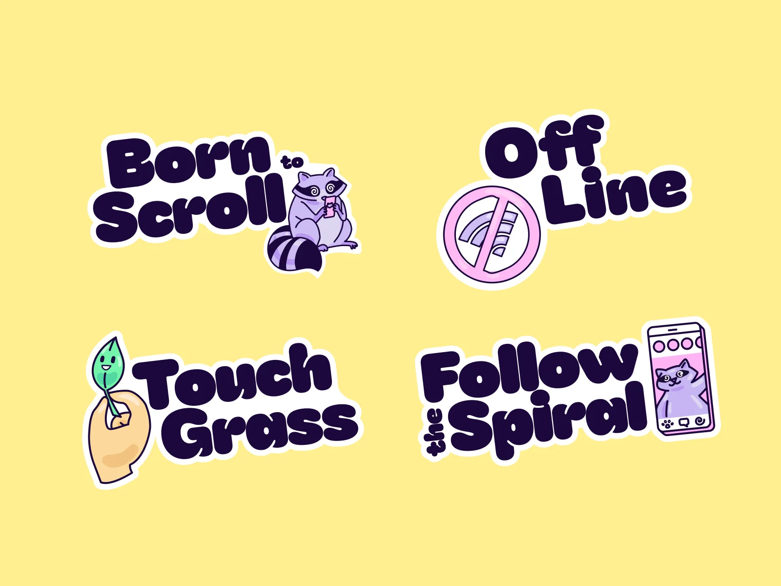
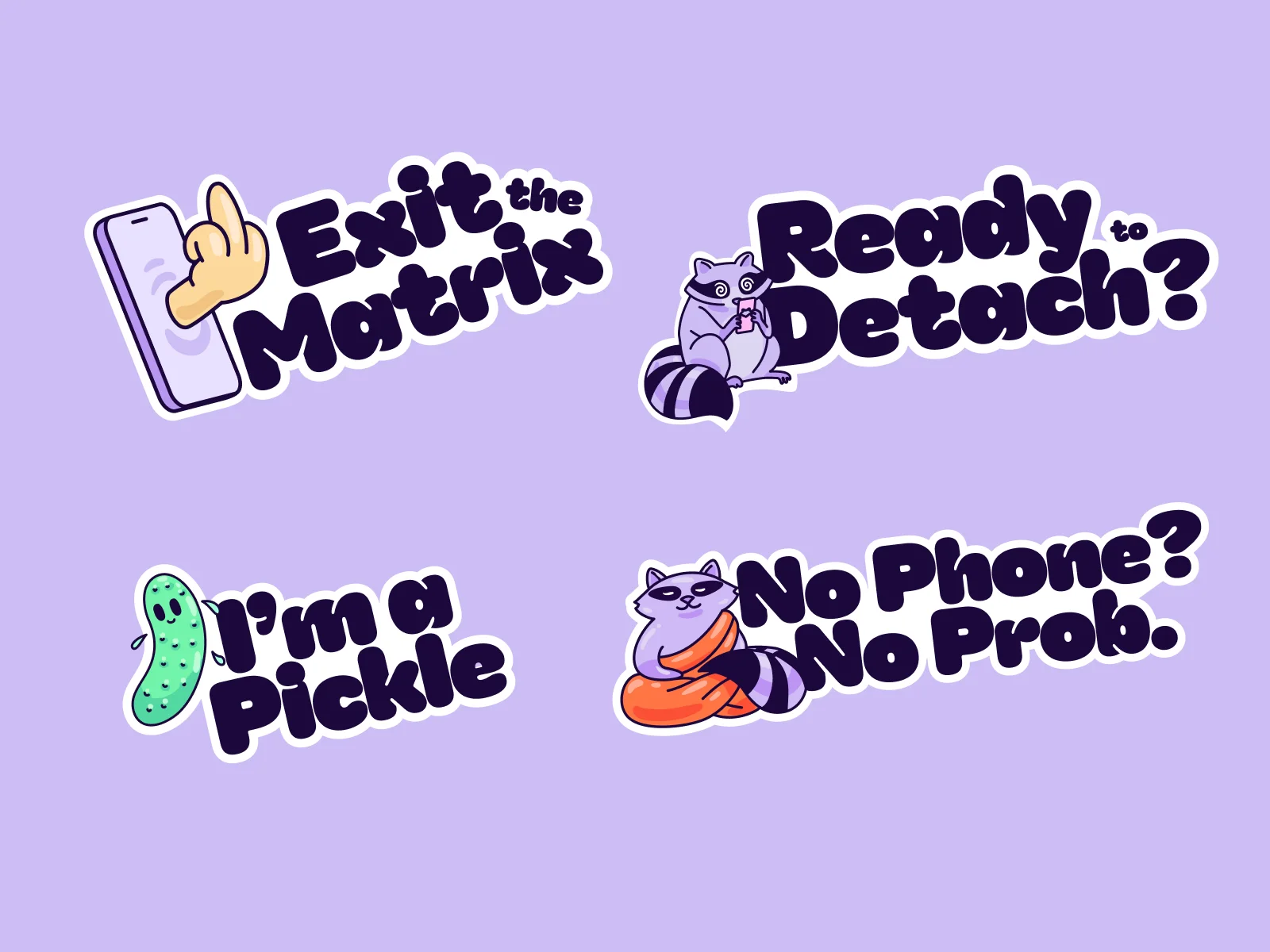
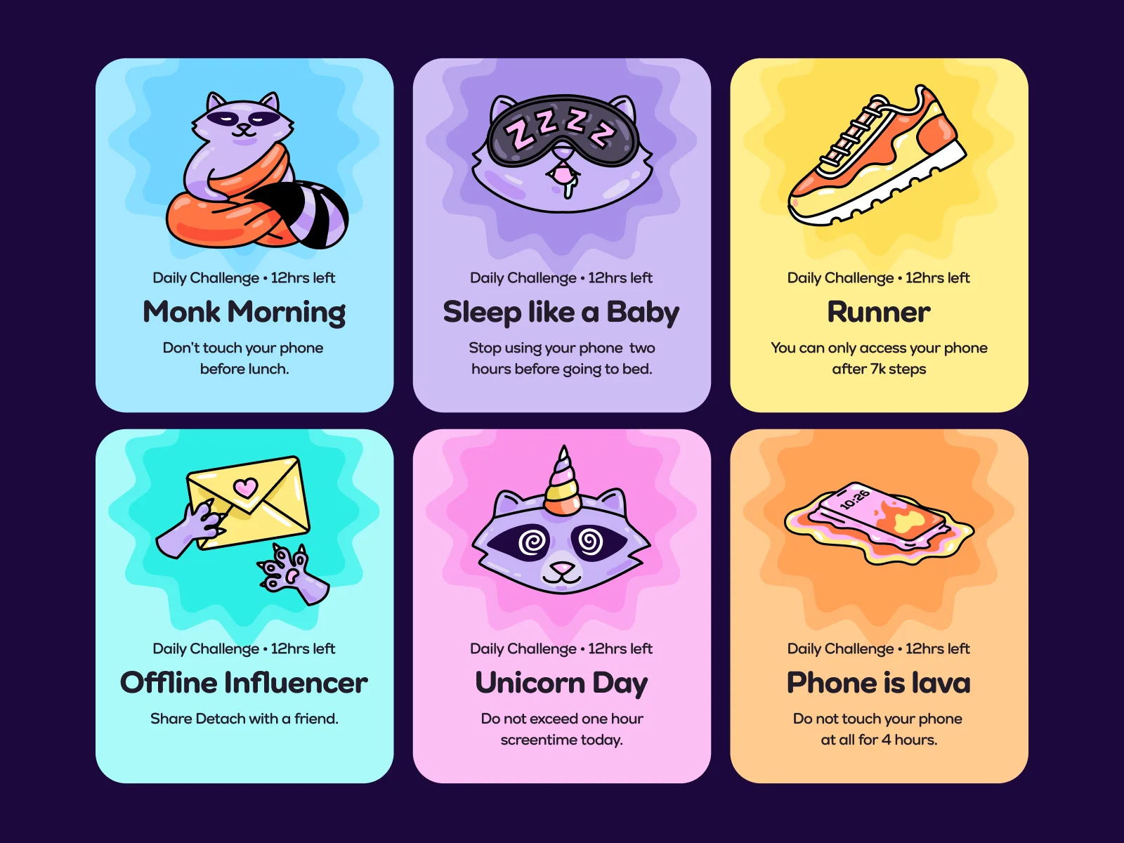
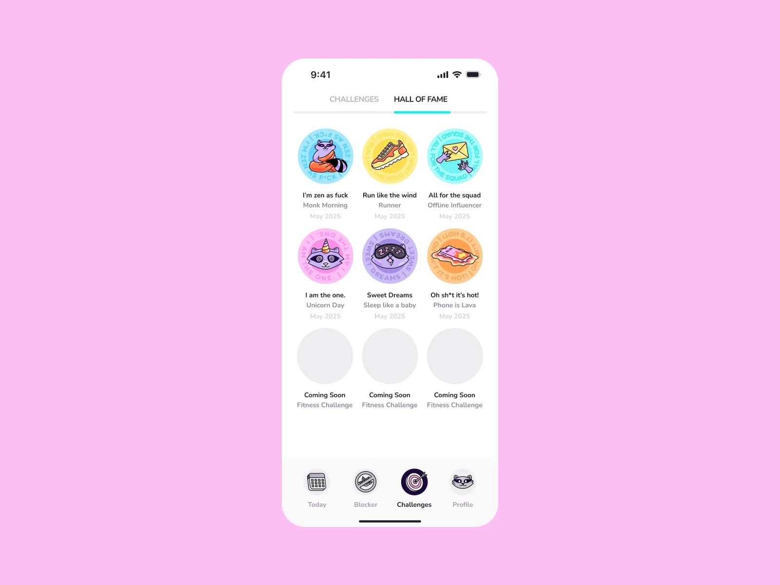
Once the raccoon was approved, Mary Delaney drew a set of 48 stickers for the brand. They cover the things the app talks about, such as sleep, sport, social media and touching grass, and they are used in the app, on the website and in marketing.
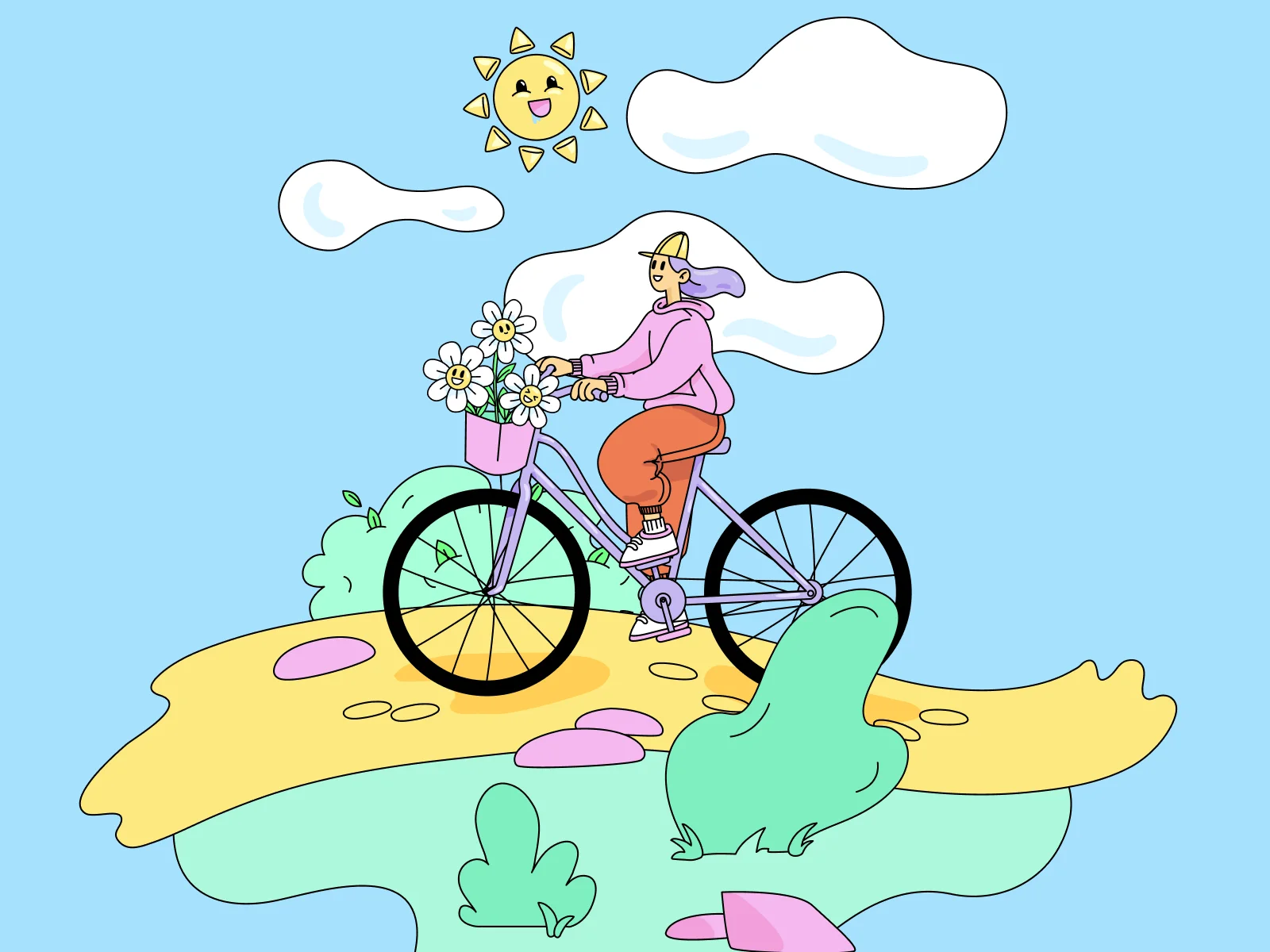
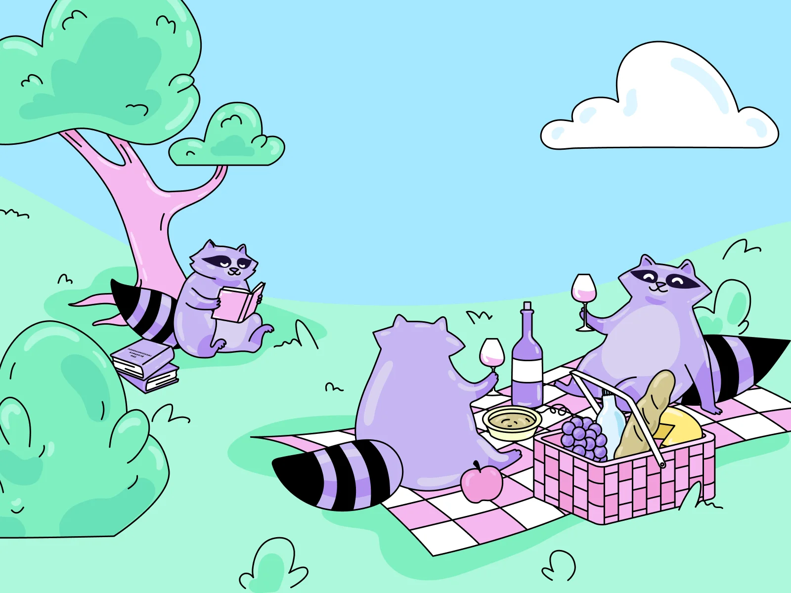
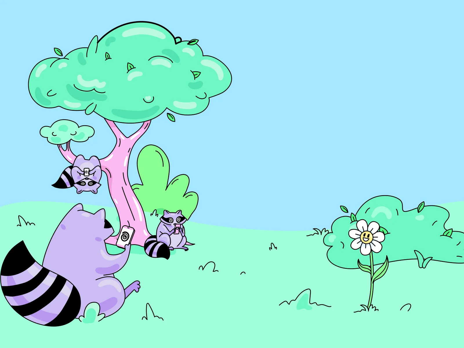
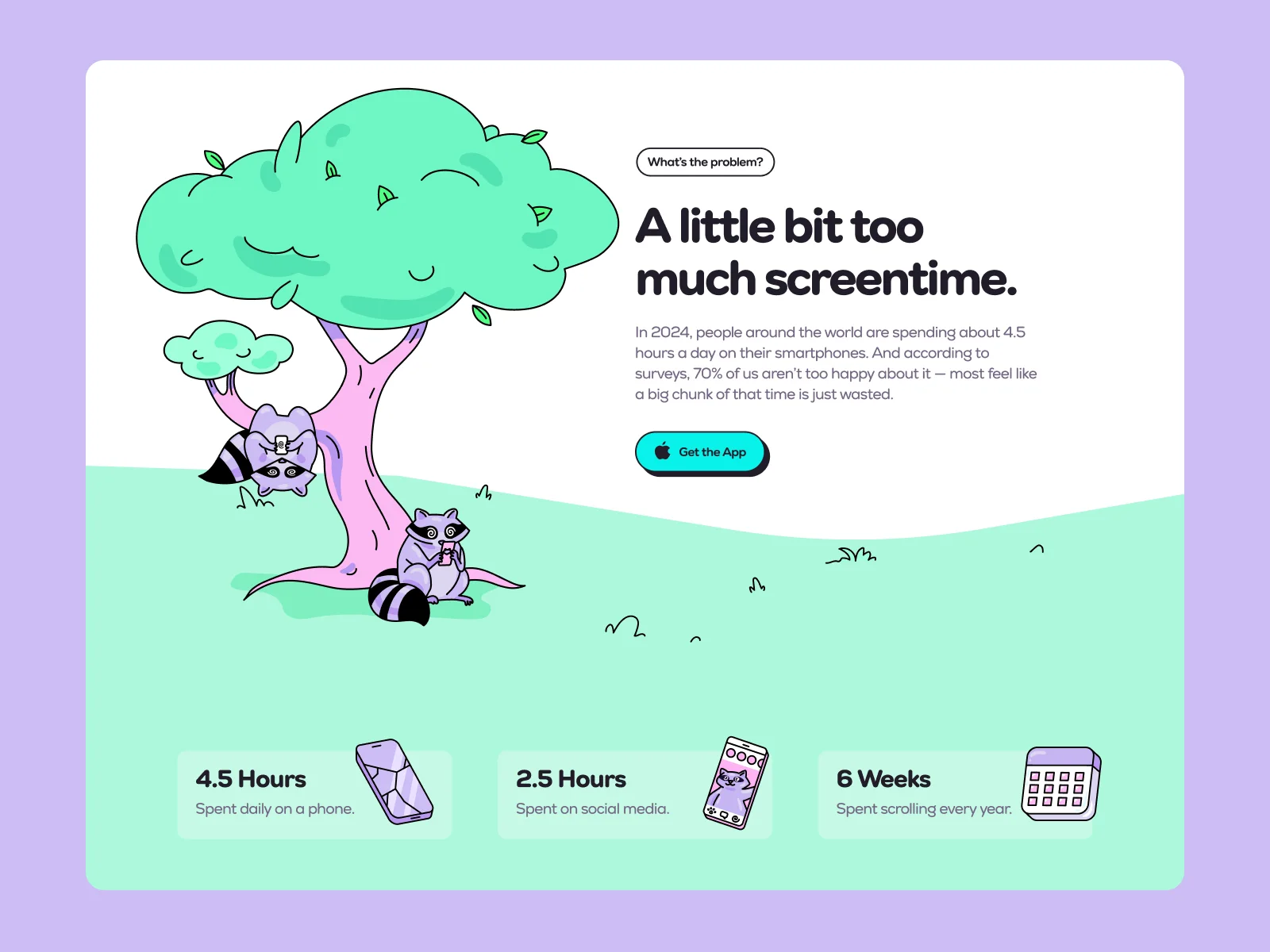
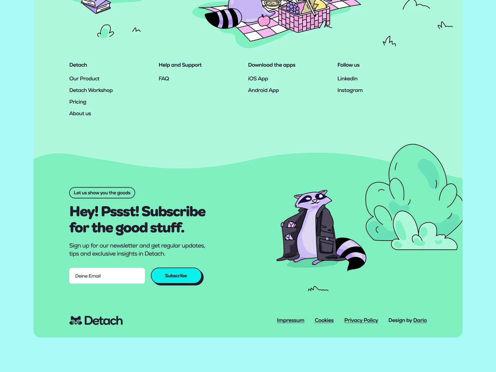
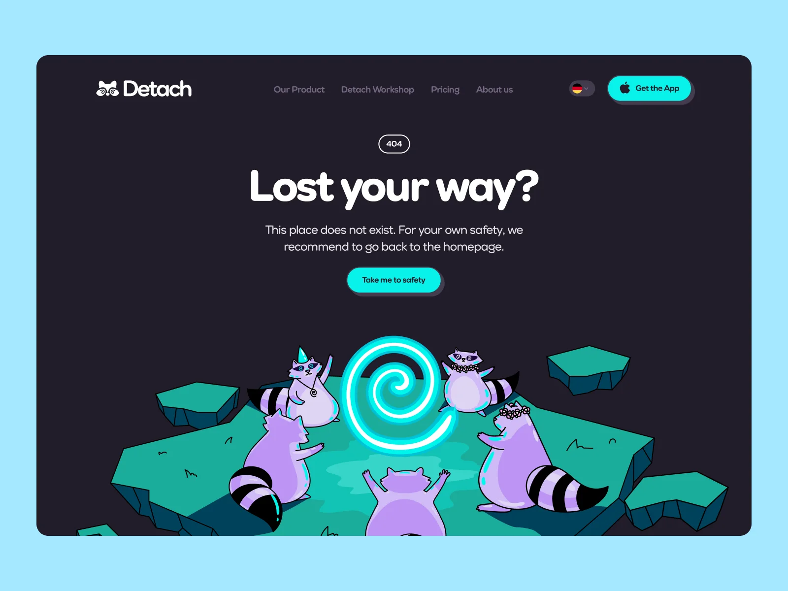
We also designed the place where the raccoons live. It is a bright landscape with trees, picnics and a blackboard where one raccoon explains the spiral to the others. These scenes are the main images on the website and in the app, so Detach does not need stock photos.



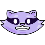


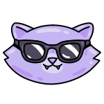

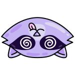
Animated mascot states for the app
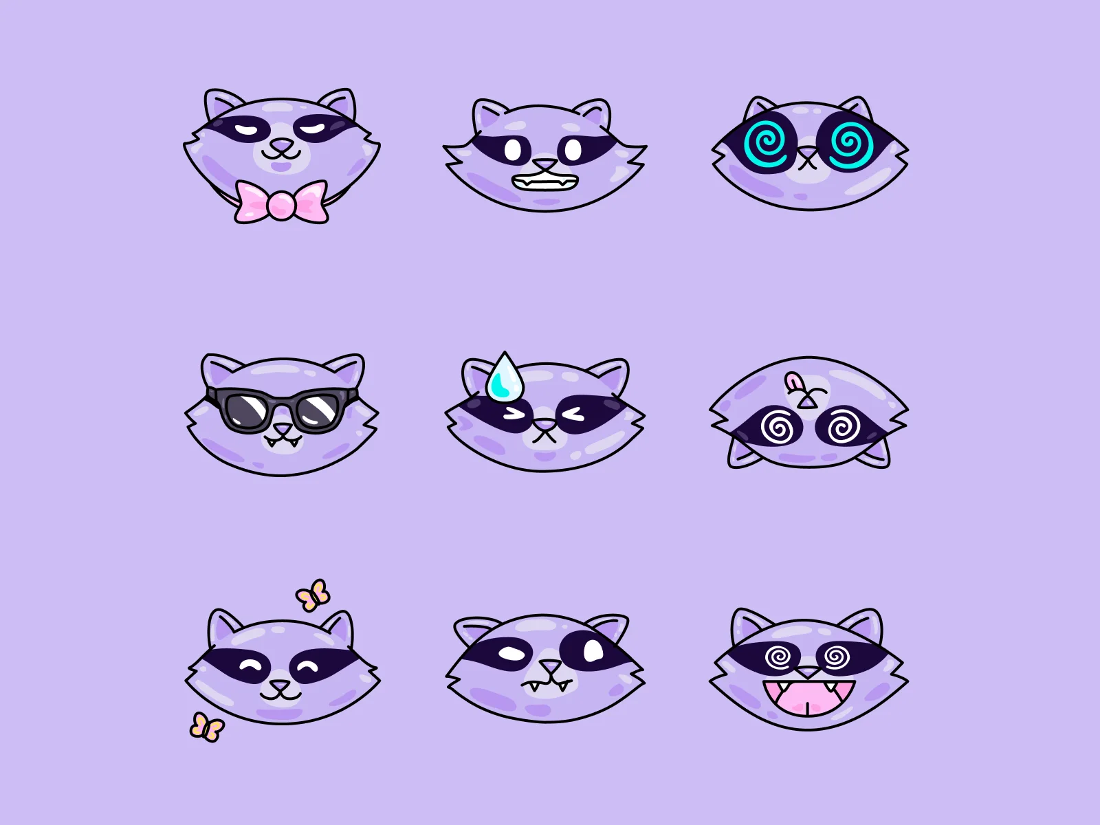
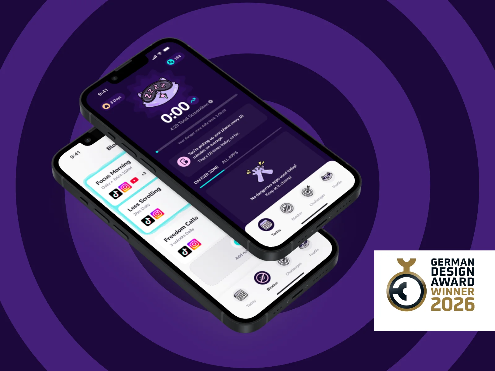
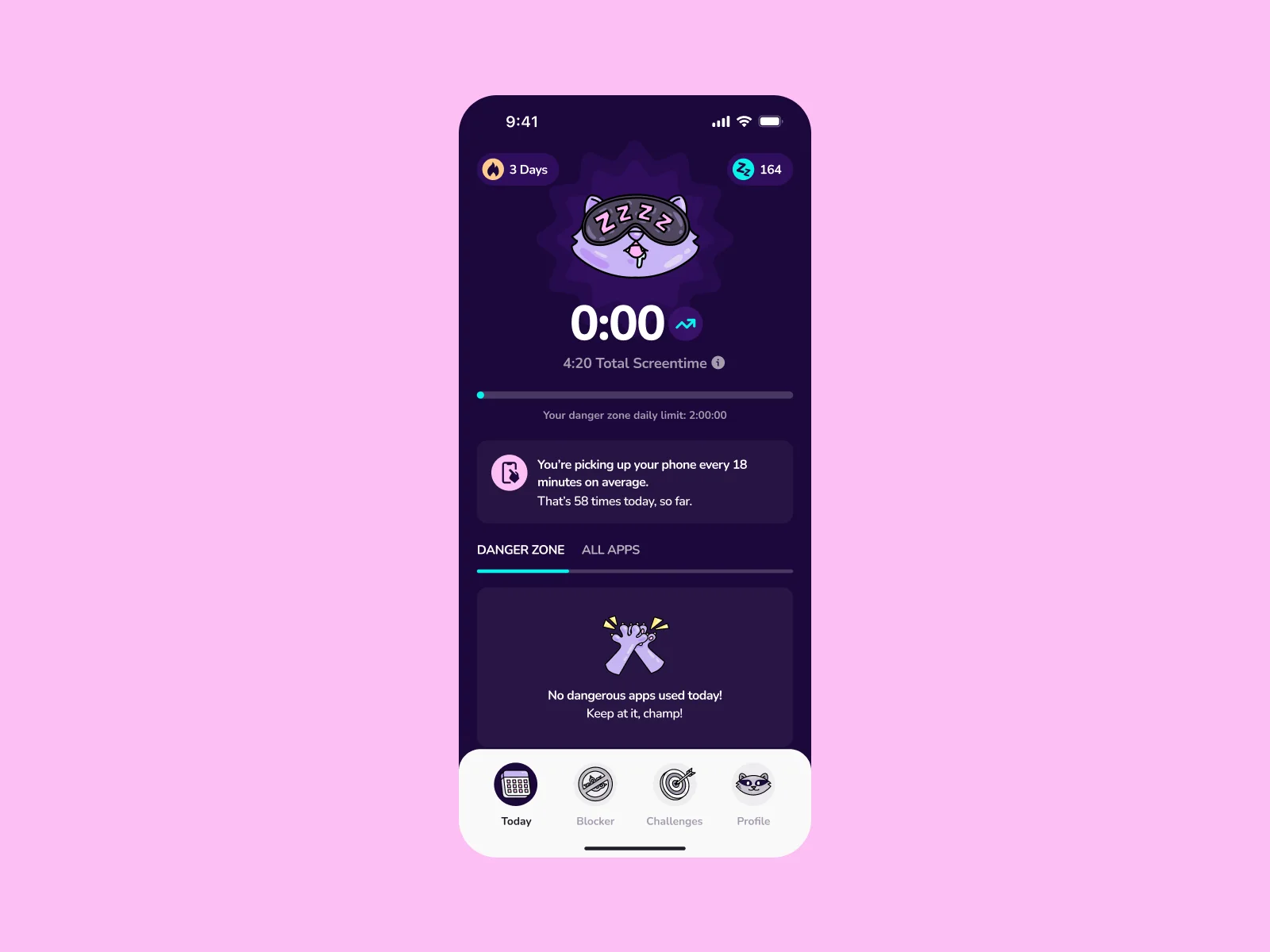
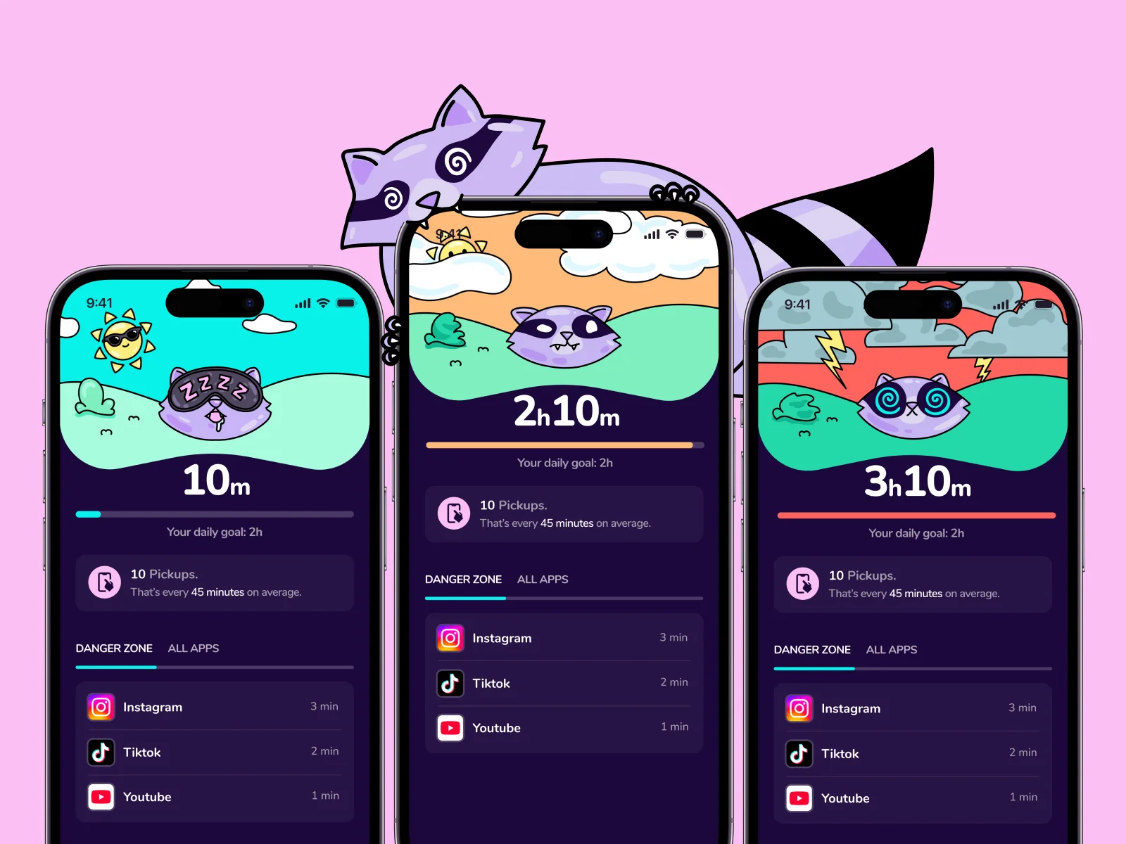
The app dashboard shows a raccoon head that changes with your screen time. At the start of the day it is calm. The more you use your phone, the dizzier it looks, until its eyes turn into spirals.
Arsen Airyan animated these states and delivered them as Lottie files for the iOS app. He also made the brand reel at the top of this page.
04Branding
Brand identity and guidelines
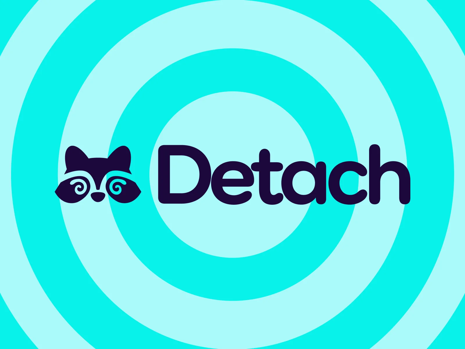
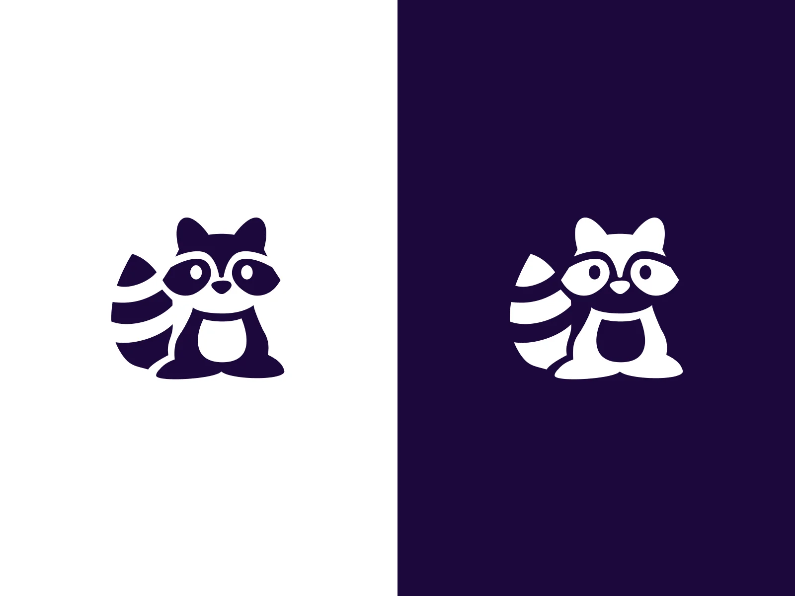
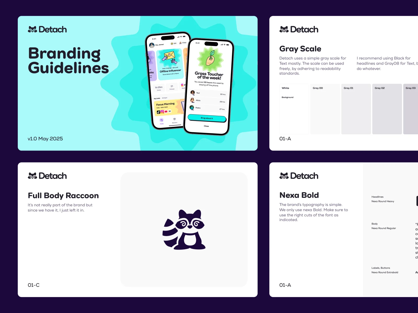
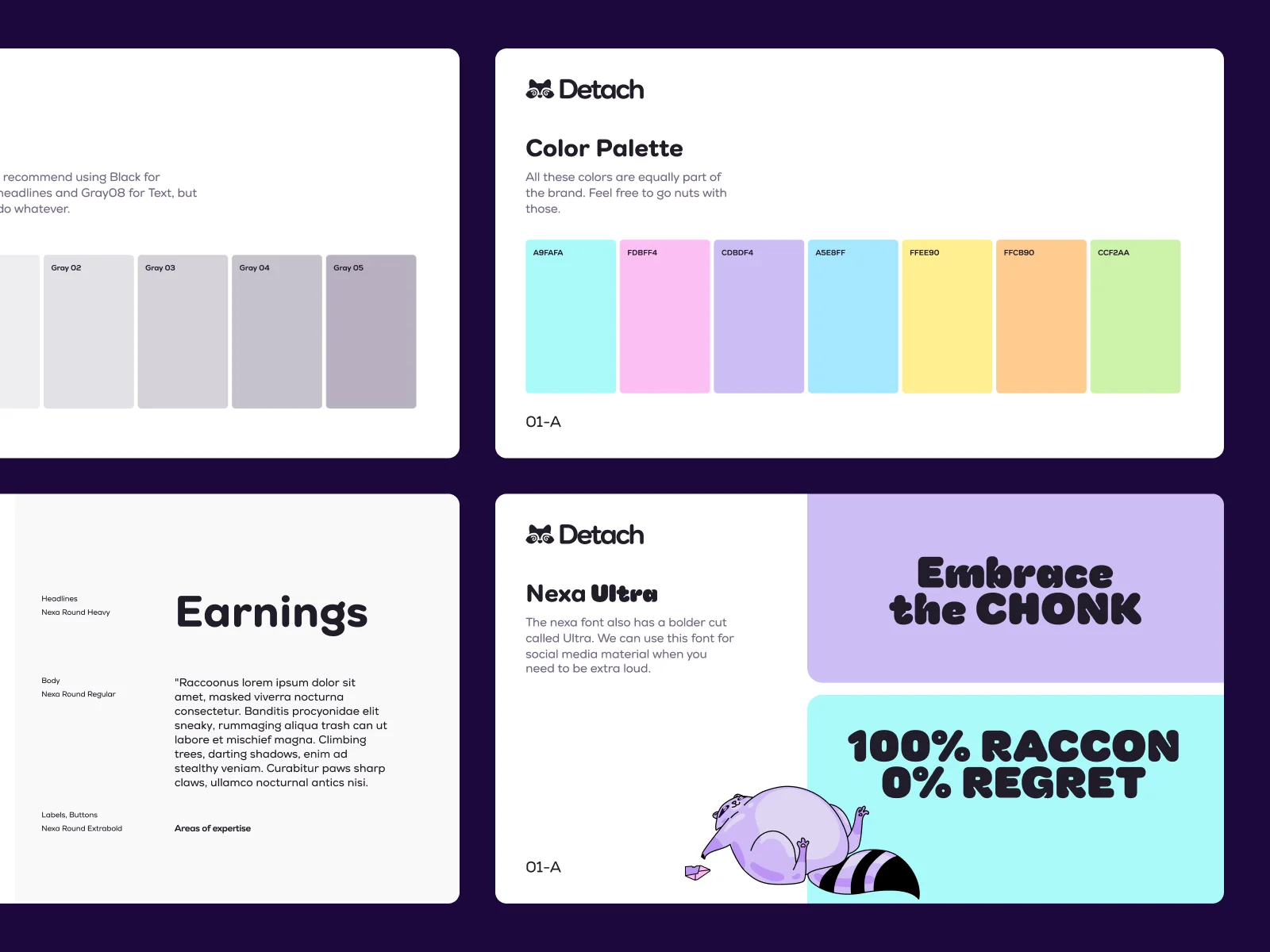
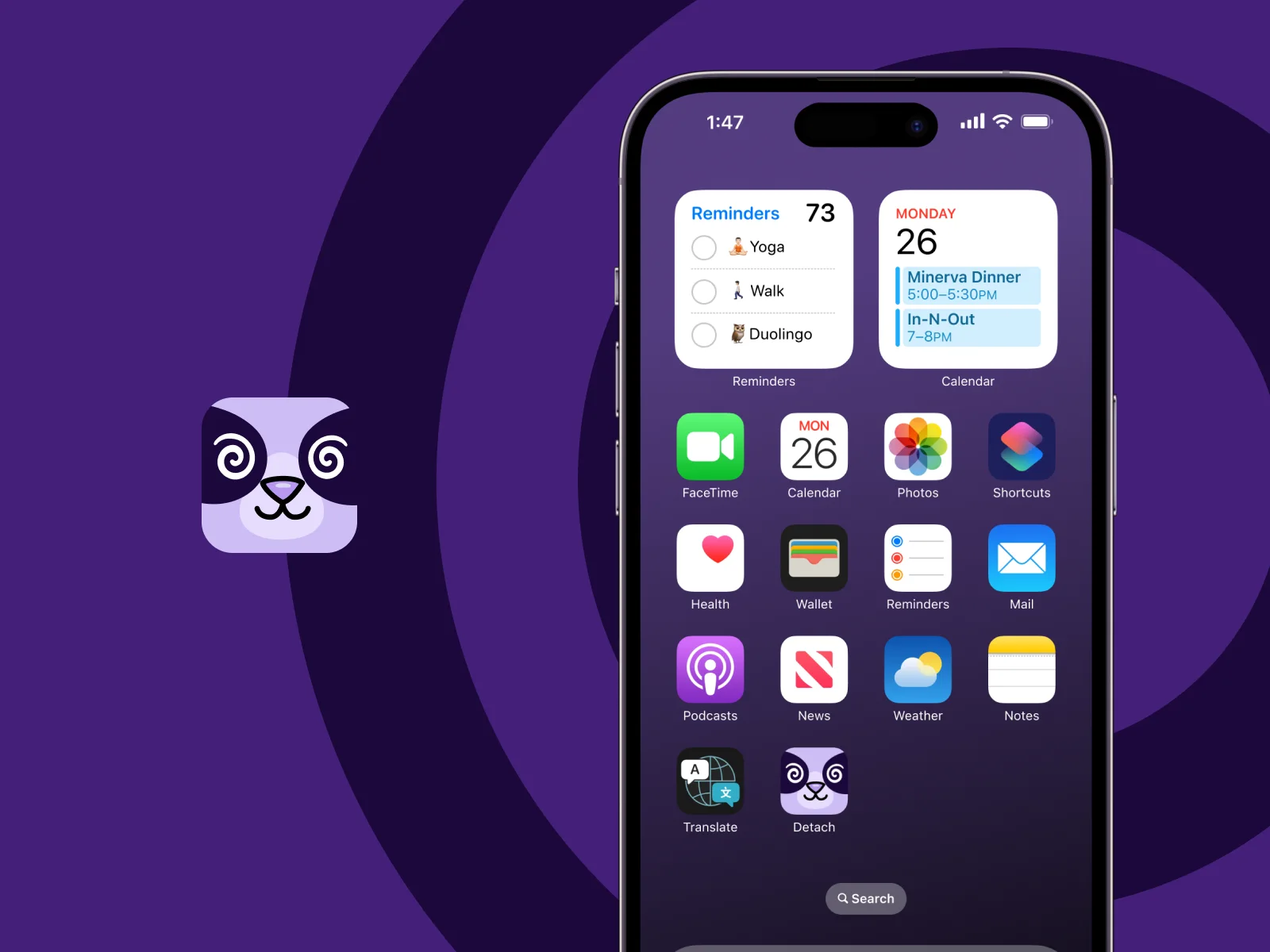
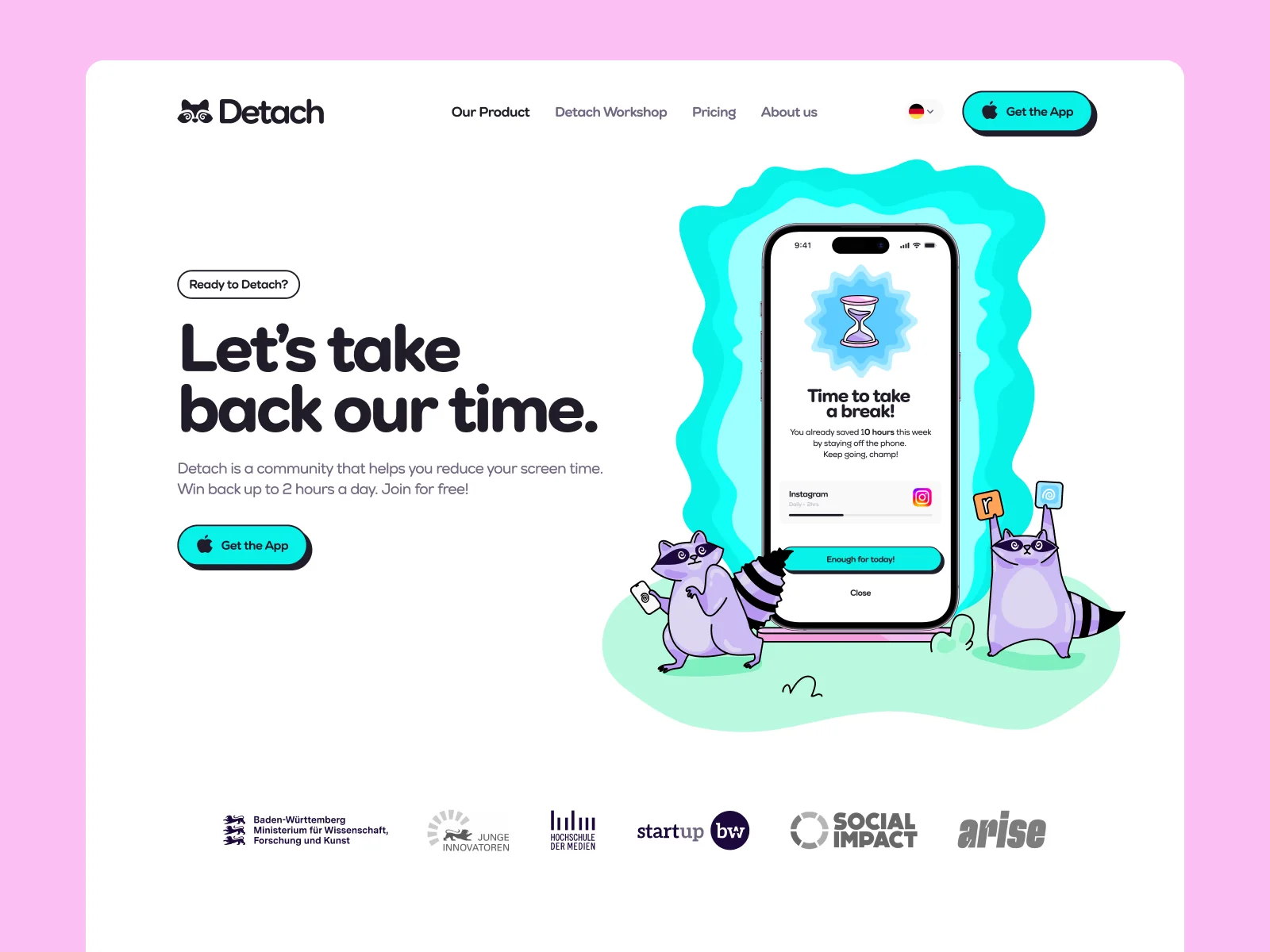
The logo is the raccoon’s face with spiral eyes, next to the Detach wordmark. There is also a full-body version of the raccoon. The colours are lilac, cyan and deep purple, with pink and yellow as accents, and the headlines use a heavy rounded typeface.
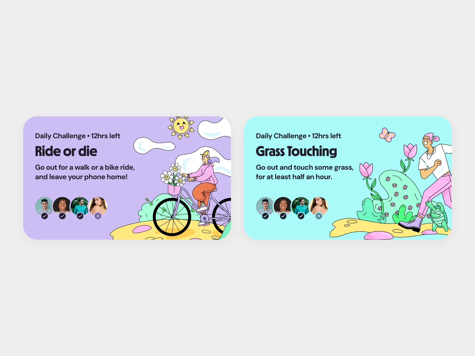
We wrote brand guidelines that cover the logo, colours, typography and tone of voice, so the Detach team can make new material on their own. We also designed the challenge cards that appear throughout the product.
iOS app design
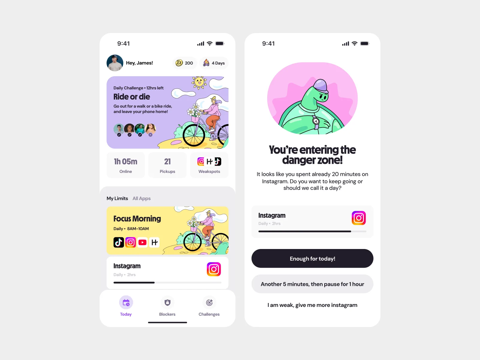
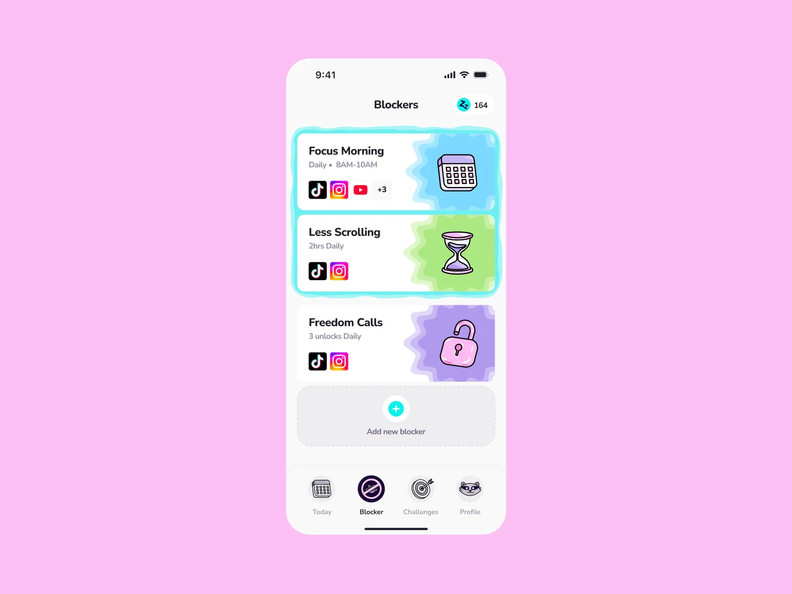
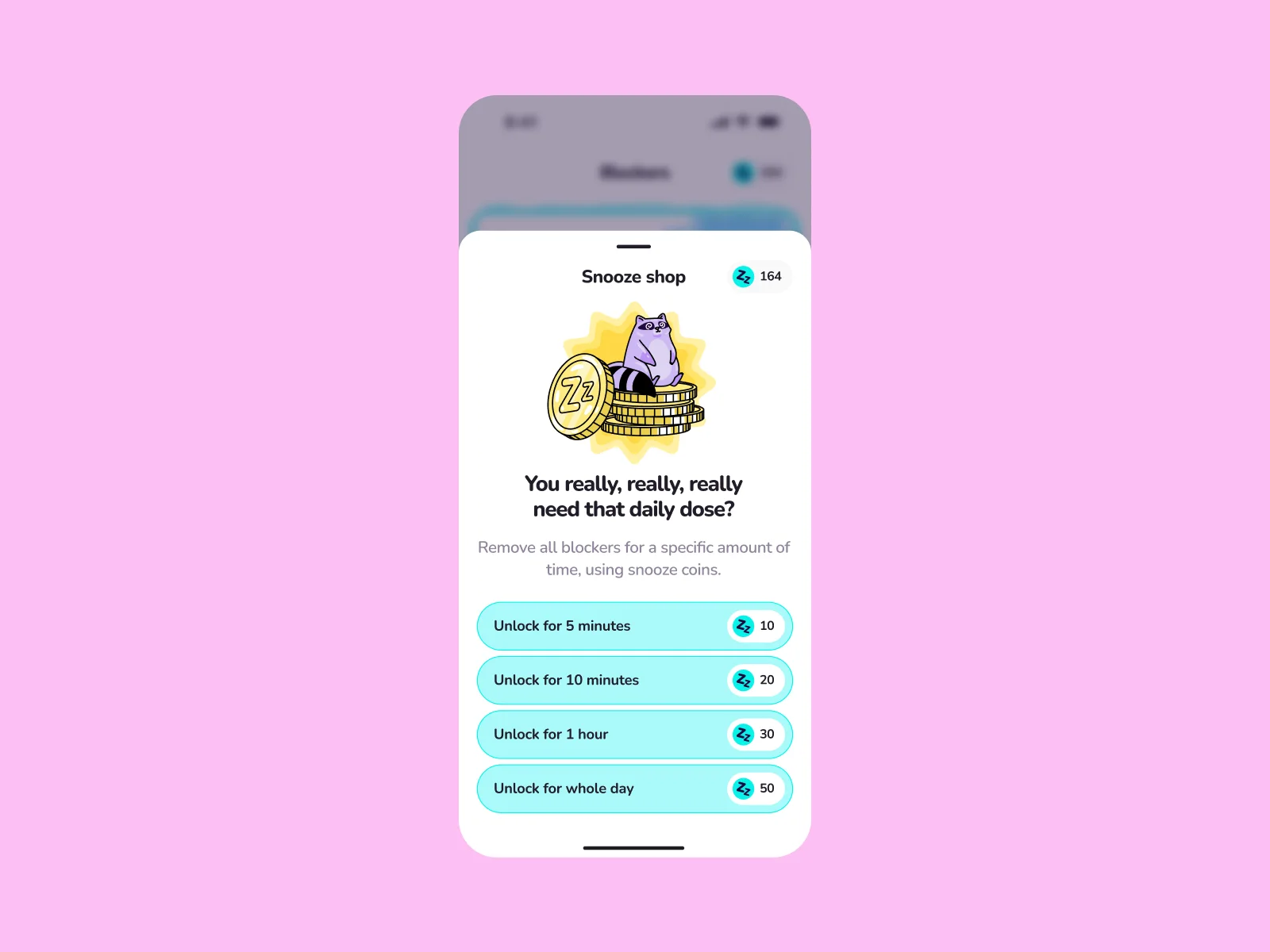
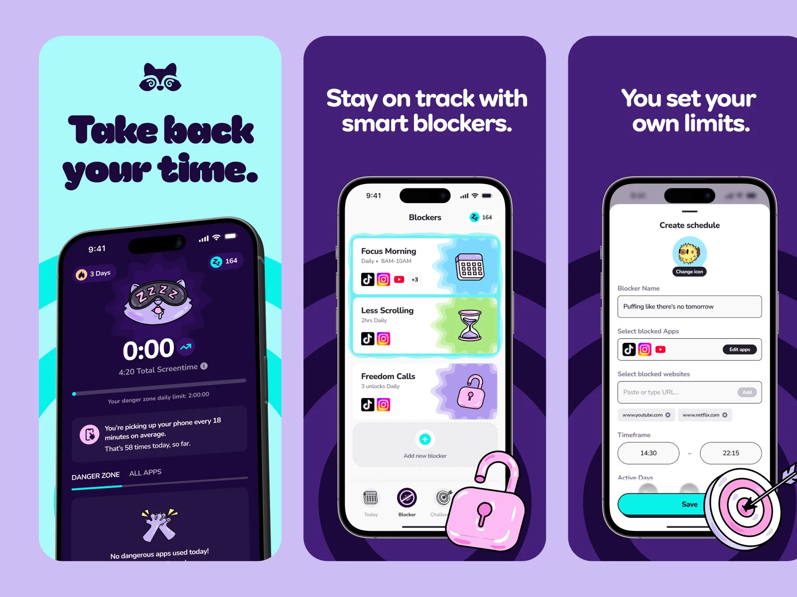
We designed every screen of the Detach app: onboarding, app blockers, daily challenges and the dashboard with the raccoon. We also designed the App Store screenshots and the app icon.
The same team did the brand and the app, so the app uses the brand as it was designed, with the same colours, type and raccoons.
Website design
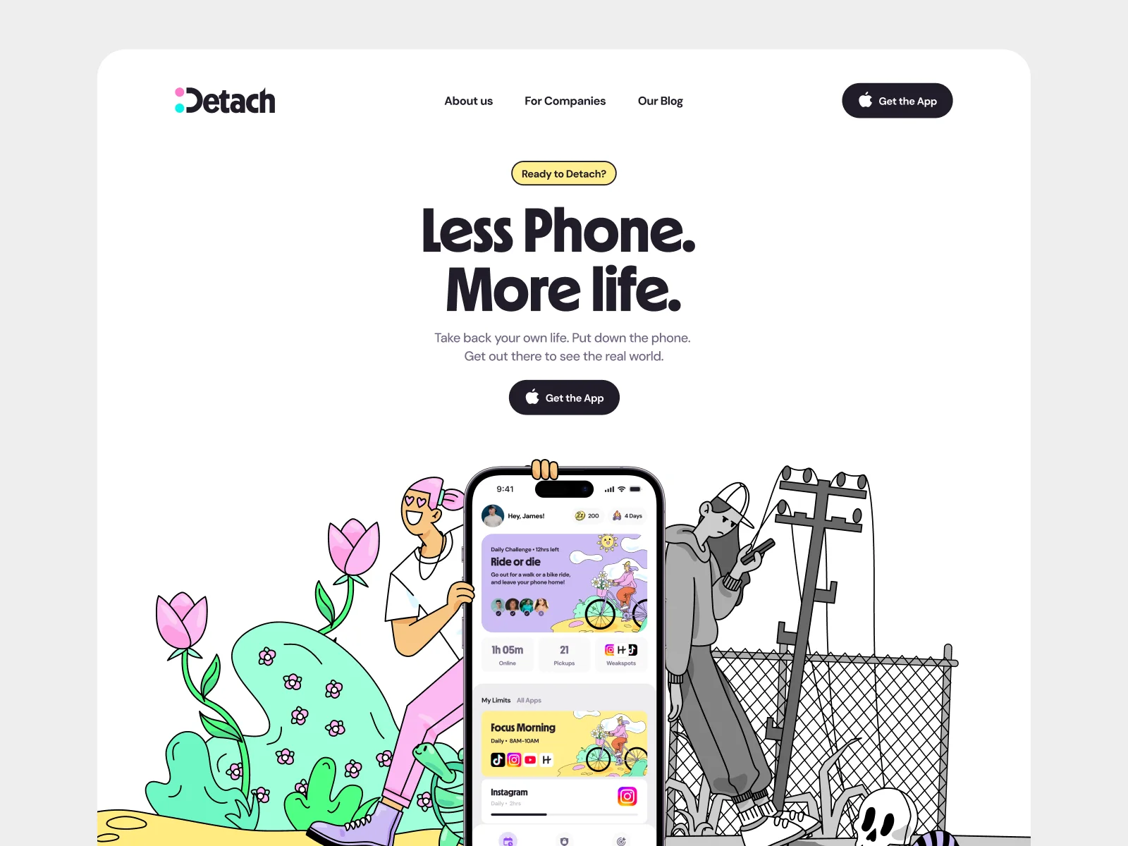
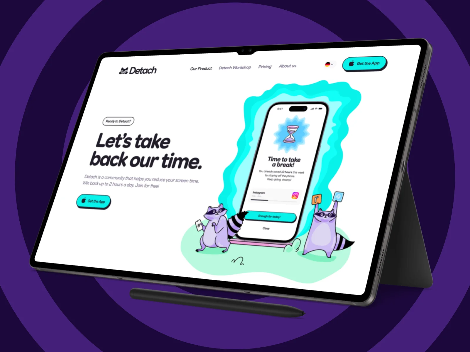
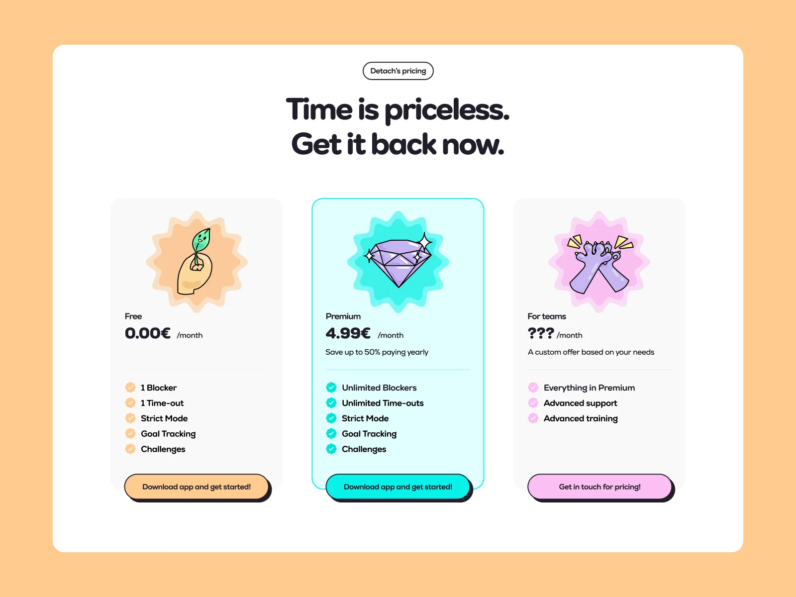
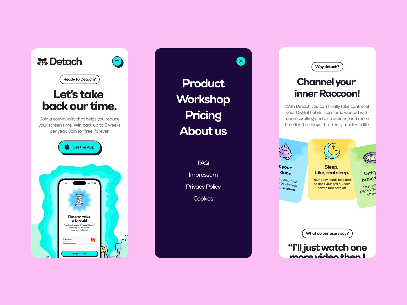
The website explains the app with illustrated scenes from the raccoon world. We designed the homepage, the pricing section, the footer and a 404 page, for desktop and mobile. The site is live at detach-app.de.
Result
The Detach team and their users liked the new brand. The app launched on the App Store in Germany, and the rebrand won a German Design Award in 2026. We still work with Detach on new projects.
Team on this project
- Creative direction, brand, app and web designDario Ferrando
- Mascot design and illustrationMary Delaney
- Animation and reelArsen Airyan