Mascot redesign and refresh

We redesign existing mascots: we keep what people already recognise and fix what holds the mascot back, usually a shape that is hard to animate, too few expressions or files that do not work in the product.
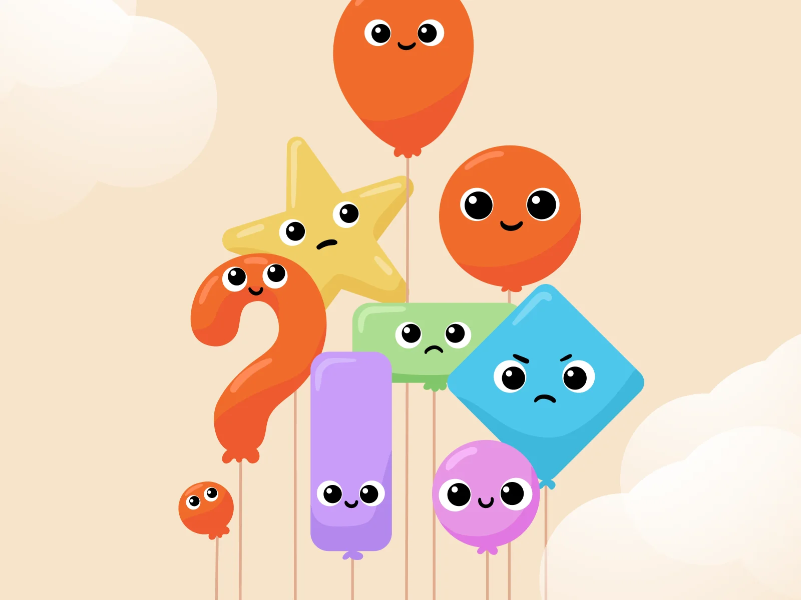
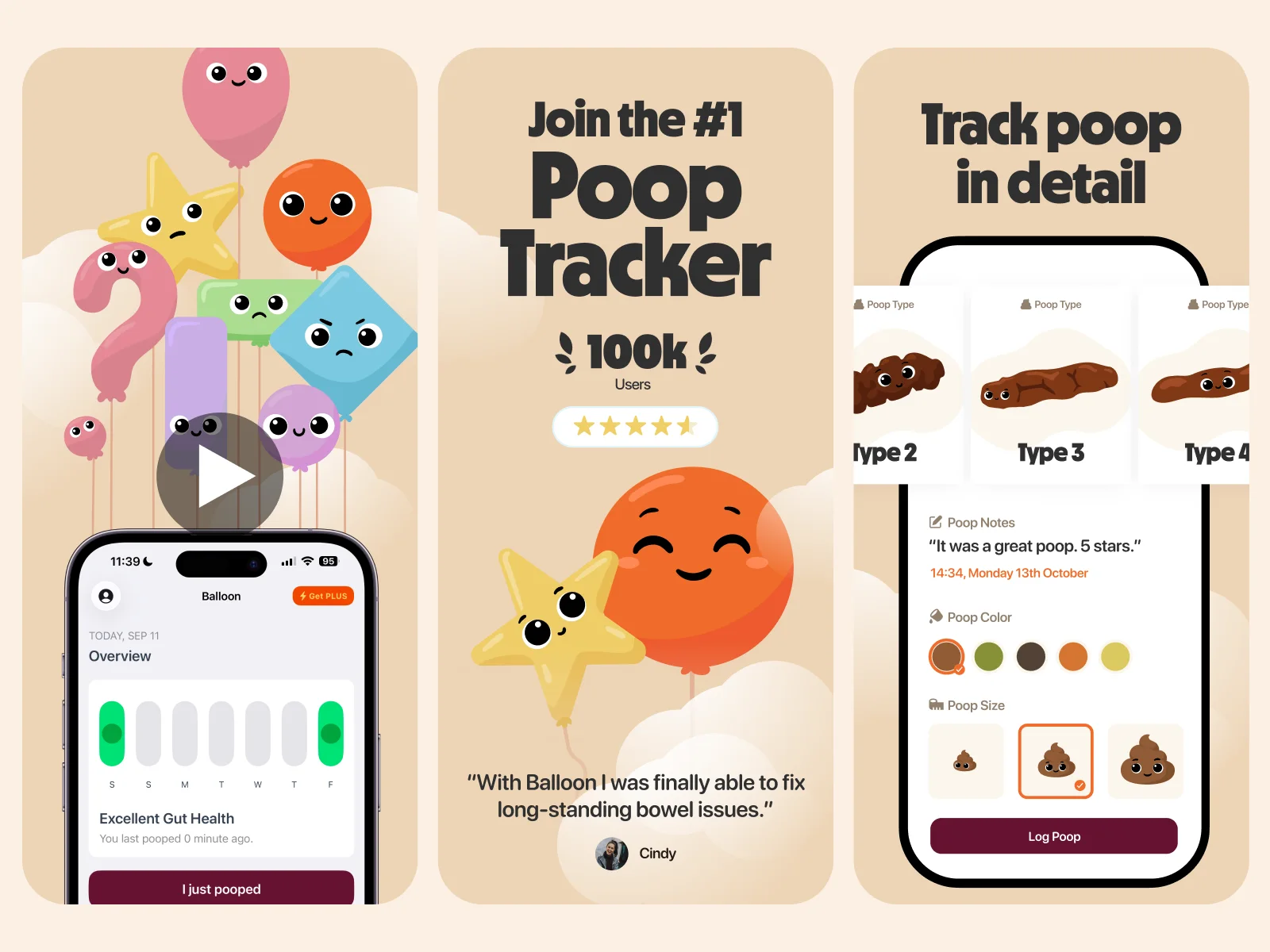
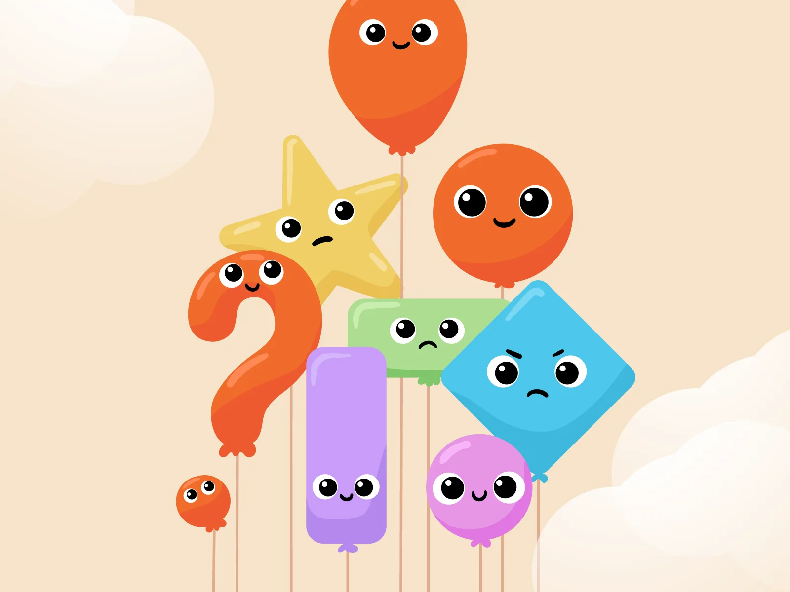
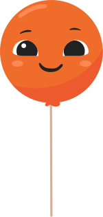
Balloon, a gut-health tracking app, already had a mascot. We rebuilt it with a simpler shape and a much wider range of expressions, then extended it into a family of supporting mascots, a new logo and App Store screens.
Start a project →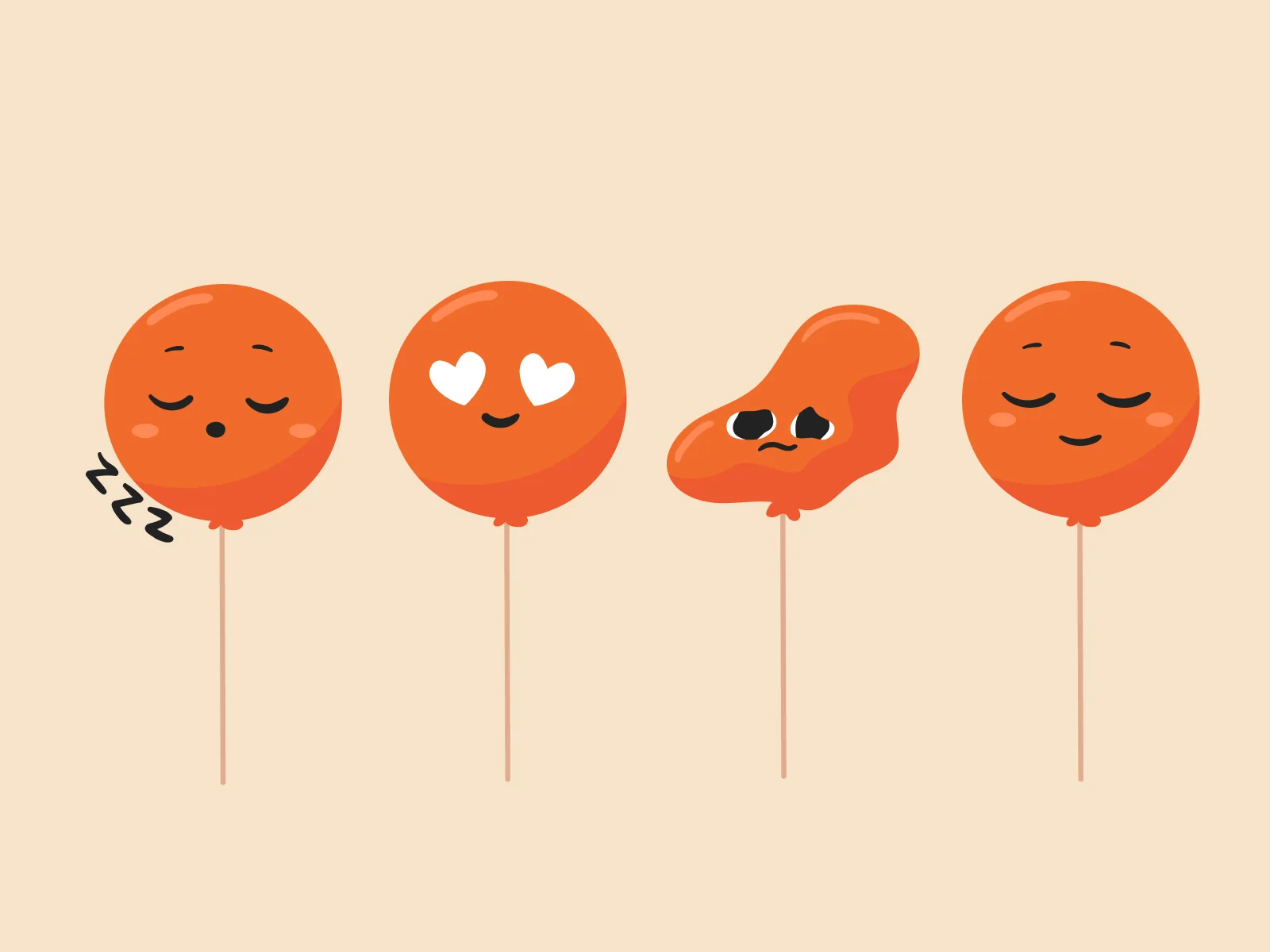
What is included
- ReviewWhat works in the current mascot and what does not.
- RedesignA cleaner version that keeps the recognisable traits.
- Expression sheetThe emotional range the old version was missing.
- Poses and statesNew poses and product states.
- Animation-ready filesArtwork structured so it can be animated.
- RolloutUpdated logo, App Store screens and guidelines.
Projects with mascot redesign
Questions about mascot redesign
Will our users still recognise the mascot?
That is the point of a redesign as opposed to a replacement. We keep the traits people associate with the brand, such as the colour and the basic shape, and improve the rest.
When does a mascot need a redesign?
Common reasons are that it only exists in one pose, it cannot be animated, it looks dated next to the product, or the product has grown and the mascot has not.
Can you redesign only the mascot and leave the brand alone?
Yes. A redesign can be limited to the mascot and its expression set.